04.19.09
Unemployment maps
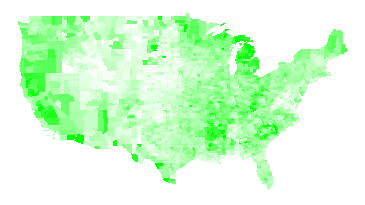
I have been looking at unemployment figures today. Here’s unemployment rate by county for 2008, from the Bureau of Labor Statistics. Pure white corresponds to a rate of 2%; pure green corresponds to a rate of 10%.

Unemployment Rate 2008
Note that the unemployment rate is dimensionless, i.e. it’s the number of people looking for work divided by the number of people in the workforce. The BLS makes its estimates by interviewing thousands of people each week and carefully asking them questions about their employment. If they have worked at all in the past week (even part-time), that counts as employed. If they haven’t looked for work in four weeks, they do not count as being in the workforce. This means that retired people, stay-at-home moms, and people who have given up do not count. (The BLS has a good explanation of their methods.)
Here is the unemployment rate by county for 2007:

Unemployment Rate 2007
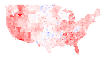
Again, I think the more interesting picture is the difference between the two years; red where unemployment has gone up, blue where unemployment has gone down. Full red means a change of +5 percentage points or more; full blue means a change of -5 percentage points or more.

2008 unemployment rate minus 2007 unemployment rate
There’s an awful lot of red there, alas. The unemployment rate fell in 272 counties and rose in 2767 counties.
Things worth noting about the above maps:
- There are a fair number of state boundaries visible in the 2008 minus 2007 map. For examples, Wisconsin is particularly visible, Wyoming is visible to a lesser extent, and there is also a line visible running along the north side of Oklahoma, Arkansas, Alabama, Mississippi, and South Carolina, and a line along the east side of Alabama. I think this means that state policies actually do matter.
- West Virginia had lower unemployment in 2008 than 2007. I presume that was demand for coal relating to the high price of oil in most of 2008. The Oklahoma drops in unemployment also be due to the higher value of oil; I don’t know why North Dakota did better.
- Woods County, OK, which is the bright blue spot in near the center of the country in the 2008 minus 2007 map, has a relatively small population: 120 people were unemployed in 2008 versus 261 in 2007. Oklahoma’s economy has a large fossil fuel component.
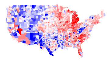
It’s also interesting to look at the difference between 2008 and 1998:

2008 unemployment rate minus 1998 unemployment rate
Thoughts:
- Poor Michigan.
- In addition to West Virginia, the rural West had higher unemployment in 1998 than in 2008. I presume this has to do with the very strong market for resources (trees, minerals, coal, etc.) for most of 2008.
I have added the first three maps to my elections map page. (Note that I have data such that I can put even more maps on the page, but I worry about the UI getting too cluttered. Thus, if you really want to see some map, let me know.)
Update: A friend of a friend pointed me at Wisconsin Business Climate Statistics. That page points out the Wisconsin has a very lean government, low taxes, low crime,and tax exemption for energy used in manufacturing. Frankly, it sounds like a Republican party platform — even though Wisconsin is a very Democratic-leaning state.

Tamfang said,
December 2, 2010 at 2:09 pm
Comparison of the last two maps suggests that State policy has more effect in the short term than in the long term. Curious.
Tamfang said,
December 3, 2010 at 3:33 pm
Or maybe it only shows that State policy fluctuates.