02.16.06
Google maps + U.S. Census data
I spent essentially all day today working on my Google Maps / U.S. Cenus mashups (instead of working on my Parallel Algorithms homework like I should have).
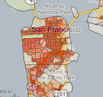
I think it’s pretty cool — I can display a lot of different population-based data overlaid on Google Maps. Here’s a piece of the population density overlay around San Francisco:

You can see Golden Gate park, The Presidio, golf courses, and the commercial district as places where people don’t live.
To the best of my knowledge, this is one of the first area-based Google Maps mashups, and depending on how strict your definition is, it might be the first area-based mashup. (This is opposed to the many point-based mashups, where there are markers at specific points.)
(Addendum: After I wrote the above, someone pointed out area-based satellite reception map. So now I have to say that mine is the probably the first shaded area-based display.)
There might be a good reason why there aren’t many area-based mashups: it’s computationally quite expensive. I’m actually a bit nervous about the possibilities of a success experience. I might really trash my server if a lot of people start banging on it.
I have ideas of how to make it less computationally intensive, including caching data, but it’s not as straightforward as you might think. For example, to precompute and store all of the tiles in the US would take (by my back-of-the-envelope calculation) on the order of 1000G. In expert mode, a user can choose between 36 numerators and 5 denominators for 180 different maps. Furthermore, there are an infinite number of different color mappings that the user could want. That’s more storage space than I want to pay for.
I thought about maybe drawing the polygon information once, and basically filling in the colors later. However, the database lookups are themselves quite intensive. There are 65,677 census tracts in the US. The polygons representing those tracts have 3.5 million vertices between them, but I’m already approximating somewhat: if the pixel area of a tract is too small, I only draw the bounding box of the tract instead of every corner.
I probably want to cache tiles in order of use. That’s pretty simple and straightforward, but I will have to then figure out a caching strategy for getting rid of tiles, or else buy lots and lots and lots of disk space.
Something else that would help a lot would be if people could switch data overlays without losing their lat/long/zoom place. I think I should be able to put links in the sidebar that get dynamically updated whenever the map center changes.
However, all of these things take some time, and I’m getting anxious about how I’ve been neglecting my schoolwork to play with the maps. The maps are more fun.

Best Webfoot Forward » Blog Archive » Advice to Google about maps and data said,
February 16, 2006 at 10:40 pm
[…] Best Webfoot Forward « Google maps + U.S. Census data […]
Best Webfoot Forward » Blog Archive » More advice to Google about maps said,
February 23, 2006 at 11:06 pm
[…] This is another argument for why they should recognize a vested interest in making it easy for developers to add their own area-based data. If Google allows people to easily put up information about specific polygons, then Google can search those polygons. Right now, because I had to do my maps as overlays, Google can’t pull any information out of them. […]
veenix said,
October 4, 2006 at 10:13 pm
I just found out about your google maps mashup. I think it’s pretty slick! The age demographics are pretty funny when you look around say, Stanford. Everything’s red for the middle aged and above, except this odd white patch 🙂
Best Webfoot Forward » Mapeteria: user-generated thematic maps said,
May 19, 2007 at 8:08 pm
[…] A year ago, while I was in the midst of working on my Census Maps mashup, my Green College colleague Jana came up to me with a question. “I have a table of data about heat pump emissions savings for each province, and I want to make a map that colors each province based on the savings for that province. What program should I use to do that?” […]