02.20.09
Posted in Uncategorized at 12:35 pm by ducky
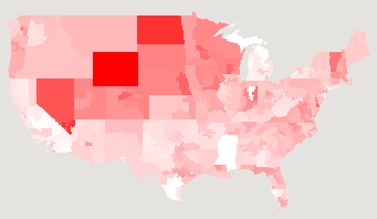
I have updated my stimulus map to give projected effects of the American Recovery and Reinvestment Act 2009 (AKA “the stimulus bill”), now that the bill is final. Here’s a snapshot of the per-capita jobs map:

There isn’t anything too surprising in this map. Note that the differences are actually rather small in reality: full white corresponds to 10.5 jobs created/saved per 1000 people, while full red corresponds to 15 jobs. One might also note that ~12 jobs per thousand sure doesn’t sound like a lot.
I only have data job creation forecasts, not tax cuts, education benefits, or extended unemployment benefits, as were in the map that showed proposed legislation.
I would like to also show the number of jobs that have been lost in the district over the past year, or the “GNP” (what’s the term for states or congressional districts?), but I don’t have that information.
In order to make this map, I needed to load up the geometries for the US congressional House districts, and I found that interesting. I had expected to see really strangely-shaped districts, but by and large they looked pretty reasonable. It might be that the districts with most extreme gerrymandering are in urban areas, and hence too small to see easily. Rural areas have much more uniform demographics, so there is less incentive to draw bizarre shapes.
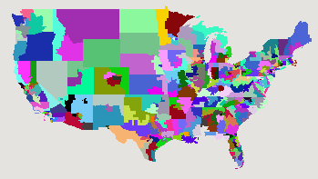
Here’s a map where each of the congressional districts is a random colour:

And, because it was easy, here’s a map of the party affiliations of members of the U.S. House of Representatives:
Update: the data that I’d gotten with the US congressional representatives was incorrect, so the picture I had at first in this post was wrong. I’ve updated the data file and the picture.
Permalink
02.17.09
Posted in Email, Too Much Information at 4:59 pm by ducky
This happened back in late 1994 or early 1995, but thinking about it still makes me laugh…
Ben Johnson, a graduate student at the University of Illinois developed a wonderful, wonderful webmail tool called @ATS to help NCSA provide email support for Mosaic, the first graphical Web browser. I was good friends with Mitch, who was in charge of Macintosh tech support for Mosaic, so I heard about it. I could see that it would be immensely helpful answering all the email questions I got in the course of my job as www.uiuc.edu webmaster, so talked NCSA/Ben into letting me use it also. Ben warned me that it was still quite new and under development, but I didn’t care — it made my life much easier even in that early stage.
Back in those days, there wasn’t nearly as much spam. The very first commercial Usenet spam had only come out in January 1994. Thus I was a little surprised to get a message to the webmaster account with an extremely pornographic subject line, and a body that was a word salad of dirty words.
I forwarded the message to Mitch, and asked in the body of the message, “Do you get messages like this frequently?” I got back a message from Mitch saying that yes, he did sometimes get messages like to the Mosaic support email address. Fine. I forgot about it.
The next day, I saw Ben. He said that he had needed to do some troubleshooting of @ATS, and had to go into my account to check something out. I had developed a webmail system myself, so empathized. This seemed perfectly understandable and reasonable to me. He continued by assuring me that he was only there for a moment and emphasized vigorously that he did not look in any of the messages, only at the subject lines.
I think he was puzzled but relieved when I burst out laughing.
I did explain why Mitch sent me a message with the subject
Subject: Re: verb your feminine-noun
and let Ben know that he didn’t need to inform the higher-ups about potential sexual harassment. 🙂
Permalink
02.16.09
Posted in Uncategorized at 11:10 am by ducky
Wow, Nate Silver just nailed it today. His posting on the two different meanings of the word “progressive” seemed very clear and resonated completely with me. I am, based on his definitions, absolutely a rational progressive.
Permalink
02.09.09
Posted in Maps, Politics at 4:11 pm by ducky
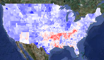
I have added the 2004 presidential election results to my politics/demographics map. Loading that data also let me provide a map of the difference between the 2004 and 2008 election:

2008 v. 2004 presidential election results
The map is red in counties that voted more Republican in 2008 and blue for counties that voted more Democratic. I think it is interesting that Arizona — McCain’s home state — pops out very clearly, while Illinois does not.
Anthony Robinson did a heroic job pulling out all the 2004 data, but there were a lot of problems with the data. I presume he had to work with preliminary data, while I could get final data. I scraped information from AZ, CA, GA, IN, LA, MO, NC, NY, TX, and VA, so I have high confidence in those states. I want to look a little more closely at Illinois — I need to be in Windows to get at that data, ugh. Alaska is a pain because it is done by house district and not by county, so I will get that in a little later.
A friend of mine had seen a similar map in the New York Times, and was surprised that Louisiana was so red. He thought that it was odd that, given the snafus after Katrina, it would have been strongly anti-Republican. I thought perhaps the data was just incorrect, but no — I verified the Louisiana data. My best guess is that the white people outside New Orleans saw a lot of images about people behaving badly in New Orleans in the Katrina aftermath. Those people were predominantly black, and I can believe that the white people nearby associated bad behaviour with “black people” instead of with “desperate poor people” or “strung-out drug addicts without a fix” or even “criminals”. They might be more inclined to vote against Obama for being black.
I actually find Oklahoma odder: Oklahoma has a relatively high percentage of Native Americans. In many places, they voted very strongly for Obama. Not in Oklahoma, they didn’t.
I also added information on governors’ and senators’ party affiliations because it was really easy to do so.
Update1: Looking at the red zones, I notice that there are very hard edges on the redness at the northern boundaries of Arkansas and Tennesee. Perhaps it isn’t really that Obama did particularly poorly there, but that Kerry did particularly well, perhaps by association with Arkansan Bill Clinton and Tenneseean Al Gore? It would be interesting to compare Obama’s margins with Jimmy Carter’s, but I don’t think it will be easy to get the 1976 election results by county.
Update2: I did find better data — all the way back to 1960! I blogged about it.
Update3: I found someone in Oklahoma. He said that Oklahoma has a low educational level, and that while many people claimed Native heritage, many of the people were only a minority Native, and were culturally white.
Permalink
02.08.09
Posted in Maps, Politics at 5:23 pm by ducky
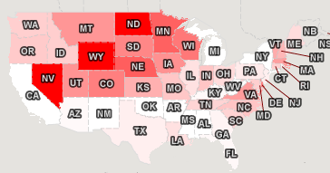
I made a new map of where the stimulus spending was forecast to go. I pulled the data from the White House Web site a few days ago, so note that it is for the proposed stimulus bill, not the bill as it passed. Also, it shows per capita amounts, using 2006 population figures from Wikipedia, so there will be a minor error due to the years being different.
I didn’t make a lot of noise about this one because I hope to do another, better one when the numbers are more stable.

Jobs created or saved per capita
Permalink
02.01.09
Posted in Maps at 11:46 am by ducky
I made a demo of my new mapping framework, a choropleth map of the 2008 presidential election that you can combine with various demographic layers, zoom in, zoom out, change the colour mapping, and all kinds of good things.
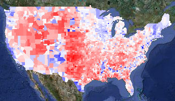
The base layer is a map of the election results by county. Here it is with all the controls clipped off:

Voting margin layer
Blue counties are ones where more people voted for Obama; red counties voted for McCain. The intensity of the colour shows how big the spread between the two candidates was. Counties are white if the race was close.
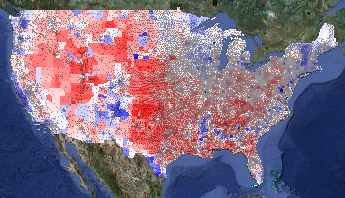
A liberal friend of mine said with some dismay, “That’s an awful lot of red!” That’s true, but most of those red counties have very few people in them. One way to get a sense of how few people live in the center of the country is to overlay ZIP code locations (presumably the centers of the ZIP codes):

Voting layer with ZIP codes overlay
(The ZIP layer is even more interesting in bigger images. I’m showing cropped, tiny versions of the map; you can select medium and huge sizes too.)
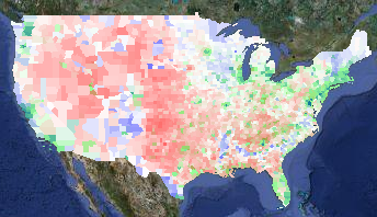
Another way to see the population density is to overlay the population density layer on top of the voting layer. I set the population density layer to go from full white at zero people per square mile to full green at 400 people per square mile:

Voting layer plus population density overlay
Note that 400 people per square mile is still very, very low compared to urban areas. (New York City has around 50,000 people per square mile. Some census tracts in San Francisco have around 200,000 people per square mile; San Quentin has a density of 250,000 people per square mile.) I recommend playing with the colour mapping to get a sense of how dramatically unevenly the country is populated.
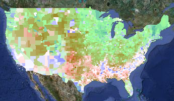
The next thing to look at is where the Obama voters were. In addition to urban areas, racially diverse areas went for Obama pretty stunningly consistently. If you lay the percent-White layer on top of the voting layer, it is really striking how often the blue of an Obama county coincides with the white of a low-percent-White county. In the percent-White overlay in this map, full white corresponds to 70% of the population or less being White, while full green corresponds to 100% White:

Voting layer plus percent-White overlay
You can see that the West Coast and the South are more racially diverse, as well as some odd, isolated islands of blue in the middle of the country — mostly in the Mountain time zone. What are those odd blocks?
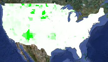
Those isolated patches of high-Obama, low-White correlate with Native American population. Here is a map of the percent-Native, with full white corresponding to 70% Native population and full green corresponding to 100% Native population. (I turned off the voting layer in the next picture.)

Percent Native American Layer
Not every place with a high Native population went for Obama. For example, Oklahoma has a high Native population, but Oklahoma went for McCain pretty reliably.
The sharp-eyed viewer will note a few blue counties in Idaho, Montana, and Wyoming that do not have a high percentage of Native Americans. These are the urban areas of Butte and Missoula, plus the resort areas of Sun Valley and Jackson Hole.
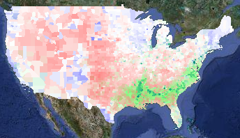
A prominent feature on the electoral layer is the blue crescent in the South. That corresponds neatly with high concentrations of African-Americans. On the demographic layer on this map, full white corresponds to 0% African-American and full green corresponds to 50% African-American:

Voting layer plus percent Black layer
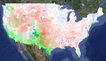
You can see correlation between Latino populations and Obama voters, although it isn’t as strong a correlation as elsewhere. In the demographic layer of the map below, full white is 0% Latino and full green is 50% Latino:

Voting layer plus percent Latino layer
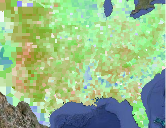
Finally, there are some pale counties in the Midwest that are surrounded by red counties. I haven’t looked at each and every one, but I think they are college towns. Here’s a zoomed-in overlay of median age over the voting layer, with full white corresponding to a median age of 25 and full green to a median age of 45:

Voting layer plus median age layer
The areas that voted for Obama that can’t be explained by population density, racial diversity, or college towns are the upper midwest (e.g. Minnesota, Wisconsin, and Iowa) and the upper Northeast (e.g. Maine and Vermont). Obama spent a lot of time in Iowa, but I guess the others are just intrinsically liberal.
I also have point-based overlays for locations of Walmarts and health food stores. During the campaign, Fivethirtyeight.com talked frequently talked about the Walmart-to-Starbucks ratio, so I wanted to show those. Unfortunately, although I found a database of Starbucks locations, I wasn’t able to get permission to use it on my maps. (It’s a pity, because Starbucks locations seemed to correlate very well with Obama votes.) I bought data of Walmart locations and health food stores (figuring that health food stores would be a squishy liberal kind of thing) but eyeballing the data didn’t really convince me there was a correlation. But you can go try it out for yourself.
You can also see the locations of all 756 Native / Alaskan / Hawai’ian reservations from the dots layer.
Finally, I have a layer that shows the total votes (Obama + McCain + everyone else) divided by the population. I don’t know how much to trust this layer, as the demographic data I have is from the 2000 census. Areas that gained or lost a lot of people in the past eight years will be skewed. While the demographic data in all the demographic layers will be slightly off, it will be worse for this layer, especially in counties that don’t have a lot of people. (Loving County, TX, had 79 presidential votes in 2008 but only 67 total population in 2000.) Rural counties tend to have more land area than urban counties, so visually they will be overrepresented.
I encourage you to go play with the maps. In particular, I had to use zoom level 3 in order to get maps that would fit on my blog, but you lose a lot of detail and information. Also, when you aren’t worrying about running afoul of Google’s copyrights, you can let the map layer peek through to give you more context for what you are seeing.
Enjoy!
Permalink
