02.01.09
Election 2008 / Demographics map
I made a demo of my new mapping framework, a choropleth map of the 2008 presidential election that you can combine with various demographic layers, zoom in, zoom out, change the colour mapping, and all kinds of good things.
The base layer is a map of the election results by county. Here it is with all the controls clipped off:
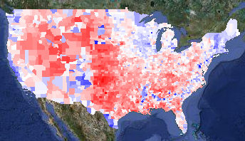
Voting margin layer
Blue counties are ones where more people voted for Obama; red counties voted for McCain. The intensity of the colour shows how big the spread between the two candidates was. Counties are white if the race was close.
A liberal friend of mine said with some dismay, “That’s an awful lot of red!” That’s true, but most of those red counties have very few people in them. One way to get a sense of how few people live in the center of the country is to overlay ZIP code locations (presumably the centers of the ZIP codes):
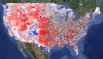
Voting layer with ZIP codes overlay
(The ZIP layer is even more interesting in bigger images. I’m showing cropped, tiny versions of the map; you can select medium and huge sizes too.)
Another way to see the population density is to overlay the population density layer on top of the voting layer. I set the population density layer to go from full white at zero people per square mile to full green at 400 people per square mile:
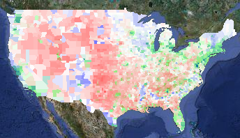
Voting layer plus population density overlay
Note that 400 people per square mile is still very, very low compared to urban areas. (New York City has around 50,000 people per square mile. Some census tracts in San Francisco have around 200,000 people per square mile; San Quentin has a density of 250,000 people per square mile.) I recommend playing with the colour mapping to get a sense of how dramatically unevenly the country is populated.
The next thing to look at is where the Obama voters were. In addition to urban areas, racially diverse areas went for Obama pretty stunningly consistently. If you lay the percent-White layer on top of the voting layer, it is really striking how often the blue of an Obama county coincides with the white of a low-percent-White county. In the percent-White overlay in this map, full white corresponds to 70% of the population or less being White, while full green corresponds to 100% White:
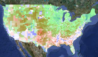
Voting layer plus percent-White overlay
You can see that the West Coast and the South are more racially diverse, as well as some odd, isolated islands of blue in the middle of the country — mostly in the Mountain time zone. What are those odd blocks?
Those isolated patches of high-Obama, low-White correlate with Native American population. Here is a map of the percent-Native, with full white corresponding to 70% Native population and full green corresponding to 100% Native population. (I turned off the voting layer in the next picture.)
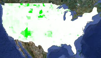
Percent Native American Layer
Not every place with a high Native population went for Obama. For example, Oklahoma has a high Native population, but Oklahoma went for McCain pretty reliably.
The sharp-eyed viewer will note a few blue counties in Idaho, Montana, and Wyoming that do not have a high percentage of Native Americans. These are the urban areas of Butte and Missoula, plus the resort areas of Sun Valley and Jackson Hole.
A prominent feature on the electoral layer is the blue crescent in the South. That corresponds neatly with high concentrations of African-Americans. On the demographic layer on this map, full white corresponds to 0% African-American and full green corresponds to 50% African-American:
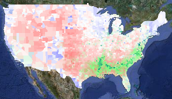
Voting layer plus percent Black layer
You can see correlation between Latino populations and Obama voters, although it isn’t as strong a correlation as elsewhere. In the demographic layer of the map below, full white is 0% Latino and full green is 50% Latino:
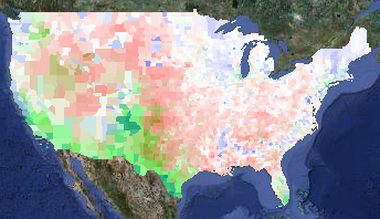
Voting layer plus percent Latino layer
Finally, there are some pale counties in the Midwest that are surrounded by red counties. I haven’t looked at each and every one, but I think they are college towns. Here’s a zoomed-in overlay of median age over the voting layer, with full white corresponding to a median age of 25 and full green to a median age of 45:
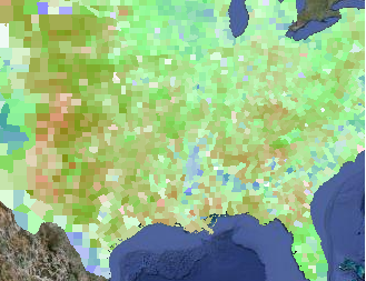
Voting layer plus median age layer
The areas that voted for Obama that can’t be explained by population density, racial diversity, or college towns are the upper midwest (e.g. Minnesota, Wisconsin, and Iowa) and the upper Northeast (e.g. Maine and Vermont). Obama spent a lot of time in Iowa, but I guess the others are just intrinsically liberal.
I also have point-based overlays for locations of Walmarts and health food stores. During the campaign, Fivethirtyeight.com talked frequently talked about the Walmart-to-Starbucks ratio, so I wanted to show those. Unfortunately, although I found a database of Starbucks locations, I wasn’t able to get permission to use it on my maps. (It’s a pity, because Starbucks locations seemed to correlate very well with Obama votes.) I bought data of Walmart locations and health food stores (figuring that health food stores would be a squishy liberal kind of thing) but eyeballing the data didn’t really convince me there was a correlation. But you can go try it out for yourself.
You can also see the locations of all 756 Native / Alaskan / Hawai’ian reservations from the dots layer.
Finally, I have a layer that shows the total votes (Obama + McCain + everyone else) divided by the population. I don’t know how much to trust this layer, as the demographic data I have is from the 2000 census. Areas that gained or lost a lot of people in the past eight years will be skewed. While the demographic data in all the demographic layers will be slightly off, it will be worse for this layer, especially in counties that don’t have a lot of people. (Loving County, TX, had 79 presidential votes in 2008 but only 67 total population in 2000.) Rural counties tend to have more land area than urban counties, so visually they will be overrepresented.
I encourage you to go play with the maps. In particular, I had to use zoom level 3 in order to get maps that would fit on my blog, but you lose a lot of detail and information. Also, when you aren’t worrying about running afoul of Google’s copyrights, you can let the map layer peek through to give you more context for what you are seeing.
Enjoy!
allen jones said,
February 3, 2013 at 3:27 pm
i found the topice on this election of o8 was instering