12.15.13
Unemployment map
I have developed some maps which show seasonally adjusted unemployment rates, by month, by county, for the past 23 years, as either a cartogram or as a standard mercator projection.
One of the stories that my unemployment map tells clearly is just how bad the financial meltdown in 2008 was, and how sudden.
This might surprise you if you saw the video of unemployment by county by LaToya Egwuekwe which went viral. It is a fine video for what it is, but I think it is slightly misleading.
Her video showed pretty clearly that things started to slide a little bit in late 2008, but the real rise in unemployment hit in 2009, with the worst being in June 2010.

Still from unemployment video by LaToya Egwuekwe
I was quite surprised when I saw this, as it didn’t match what I knew of the situation.
Below is what the national unemployment rate actually looked like over time. (The seasonally adjusted rate is darker; the unadjusted rate is lighter.)
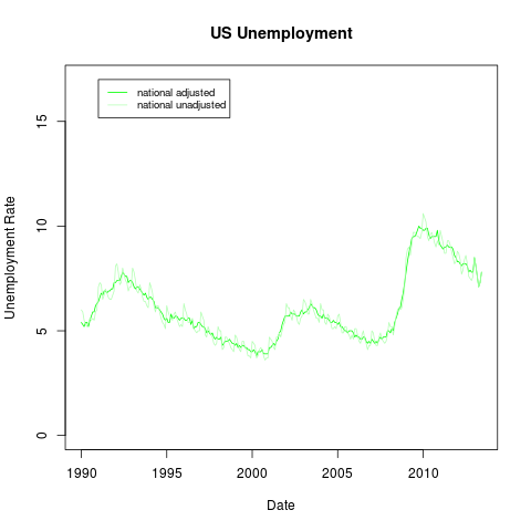
The seasonally adjusted unemployment rate actually peaked in October 2009, not in mid-2010.
Why the difference? If you look at the fine print of Egwuekwe’s video, it is a map of the 12-month rolling average of unemployment, which is a lagging indicator. This means that, for example, in October 2008, right after the financial meltdown, the unemployment numbers she used for the map included November 2007 through September 2007 — which were generally pretty good. Similarly, the unemployment later seemed to be higher than it really was because the rolling average included the previous year — which included very high unemployment.
Here is a comparison of the seasonally adjusted unemployment rate and the 12-month rolling average for 2007 through the present: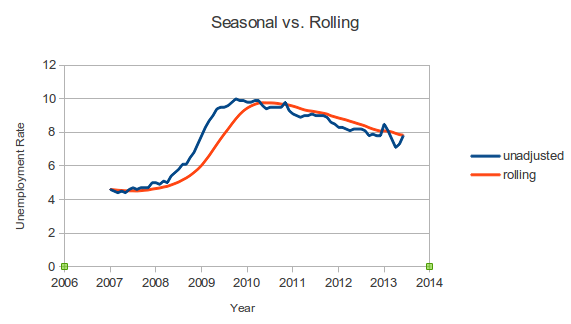
It is perfectly understandable that Ms. Egwuekwe would use the 12-month rolling average instead of the seasonally-adjusted unemployment. Why? Because the Bureau of Labor Statistics does not publish seasonally adjusted unemployment rates at the county level, and it is a royal pain to calculate the seasonally adjusted unemployment for each county individually. (I should know, because I did calculate seasonally adjusted unemployment for each county individually.)
She could have used the unadjusted unemployment rate for a county, but there can be so much seasonal variation that it is hard to see the longer-term trends. This is particularly true in agricultural communities. For example, here is a graph which shows the unadjusted unemployment rate for Clark County, IL in light blue, and the seasonally adjusted rate in darker blue.

(For comparison, the national unemployment rate is in light green.)
Thus, if Ms. Egwuekwe had used the raw unadjusted unemployment numbers for her video, the short-term fluctuations would have made it difficult to see the longer-term trends. It was a reasonable tradeoff to make.
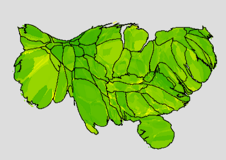
One other complaint I have about maps like hers, and well, almost all thematic maps, is that they give too much visual weight to rural areas compared to urban areas. When you see a map like the one at the top of the post, you probably do sort of a visual averaging to figure out what the overall unemployment is like. However, because there are a huge number of people in cities, and because cities are very small compared to the vast stretches of rural areas, what you see in rural areas dominates the map. A population-based cartogram — where jurisdictions are distorted so that the area of a jurisdiction is proportional to its area — gives a map which is less misleading.
Again, it’s completely understandable that people would normally use maps which show area instead of population. It’s a royal pain to generate a cartogram. (I should know, I did generate cartograms.)
Here is a population-based cartogram of the unemployment in June 2008, before the financial crisis hit, when the US seasonally adjusted unemployment rate was 4.6%:
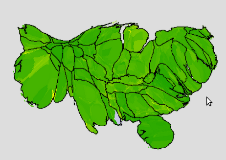
(Green is good; yellow is bad. Full green is 0% unemployment; full yellow is 17% unemployment. States are outlined.)
Now here is an image from the worst month after the financial meltdown, October 2009:
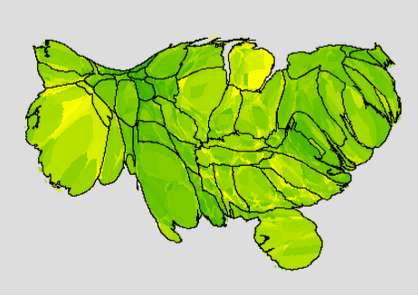
The financial crisis hit fast, and it hit hard.
The good news is that it is getting better. Here is a map of the latest month which I have data for, June 2013:
Note: it is a little difficult to recognize places when they are distorted. On my unemployment maps web page, you can show city names; you can click on a county to get more information about that county.
Permalink Comments off