02.09.09
Bush-Kerry, 2004 vs. 2008 layers added to map
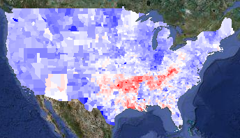
I have added the 2004 presidential election results to my politics/demographics map. Loading that data also let me provide a map of the difference between the 2004 and 2008 election:

2008 v. 2004 presidential election results
The map is red in counties that voted more Republican in 2008 and blue for counties that voted more Democratic. I think it is interesting that Arizona — McCain’s home state — pops out very clearly, while Illinois does not.
Anthony Robinson did a heroic job pulling out all the 2004 data, but there were a lot of problems with the data. I presume he had to work with preliminary data, while I could get final data. I scraped information from AZ, CA, GA, IN, LA, MO, NC, NY, TX, and VA, so I have high confidence in those states. I want to look a little more closely at Illinois — I need to be in Windows to get at that data, ugh. Alaska is a pain because it is done by house district and not by county, so I will get that in a little later.
A friend of mine had seen a similar map in the New York Times, and was surprised that Louisiana was so red. He thought that it was odd that, given the snafus after Katrina, it would have been strongly anti-Republican. I thought perhaps the data was just incorrect, but no — I verified the Louisiana data. My best guess is that the white people outside New Orleans saw a lot of images about people behaving badly in New Orleans in the Katrina aftermath. Those people were predominantly black, and I can believe that the white people nearby associated bad behaviour with “black people” instead of with “desperate poor people” or “strung-out drug addicts without a fix” or even “criminals”. They might be more inclined to vote against Obama for being black.
I actually find Oklahoma odder: Oklahoma has a relatively high percentage of Native Americans. In many places, they voted very strongly for Obama. Not in Oklahoma, they didn’t.
I also added information on governors’ and senators’ party affiliations because it was really easy to do so.
Update1: Looking at the red zones, I notice that there are very hard edges on the redness at the northern boundaries of Arkansas and Tennesee. Perhaps it isn’t really that Obama did particularly poorly there, but that Kerry did particularly well, perhaps by association with Arkansan Bill Clinton and Tenneseean Al Gore? It would be interesting to compare Obama’s margins with Jimmy Carter’s, but I don’t think it will be easy to get the 1976 election results by county.
Update2: I did find better data — all the way back to 1960! I blogged about it.
Update3: I found someone in Oklahoma. He said that Oklahoma has a low educational level, and that while many people claimed Native heritage, many of the people were only a minority Native, and were culturally white.

Best Webfoot Forward » Historical presidential maps said,
April 13, 2009 at 5:52 pm
[…] find it even more interesting to look at the differences between years, like the 2008 vs. 2004 map I commented on already. This helps separate how people felt about a particular pair of politicians from how […]