04.13.09
Historical presidential maps
I recently got historical data on presidential election results by county from Robert Vanderbei, for presidential elections 1960-2004. While it is interesting to look at the raw data, I find it even more interesting to look at the differences between years, like the 2008 vs. 2004 map I commented on already. This helps separate how people felt about a particular pair of politicians from how liberal/conservative they are in general. For example, here’s the 1960 (Nixon vs. Kennedy) map, with Democratic counties in blue and Republican counties in red:
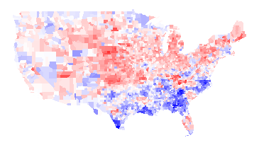
1960 -- Kennedy vs. Nixon
And here’s the 1964 (Johnson vs. Goldwater) map:
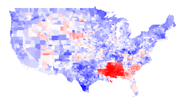
1964 -- Johnson vs. Goldwater
1964 Difference
You can see even from the 1964 map that LBJ was not very popular in the South (presumably because of his civil rights work), but the difference map below really hammers it home. In this map, it is blue if LBJ did better than Kennedy and red if the reverse. You can see from the difference map that the South really hated LBJ:
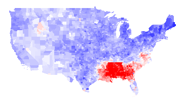
1964 results minus 1960 results
Another interesting thing about the 1960/1964 maps is that there is no evidence at all of “the black belt”. Here is a map of counties which were majority black in 2000, with darker green the stronger their majority:
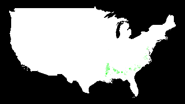
Majority-black counties (2000)
I have to believe that blacks would have overwhelmingly voted for LBJ — if they were able. I think this is a pretty vivid demonstration of how thoroughly their voting rights were repressed.
1968 vs. 1960
The 1968 (McGovern-Nixon) minus 1964 map is basically an inverse of the 1964 minus 1960 map, basically because the southern antipathy towards Johnson was so strong that it skews everything. A more interesting map is to compare Humphrey vs. Nixon to Kennedy vs. Nixon:
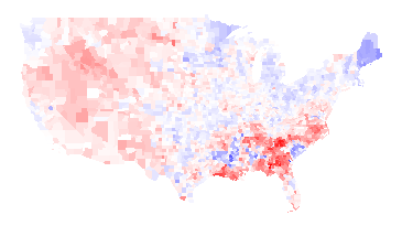
1968 (Humphrey-Nixon) minus 1960 (Kennedy-Nixon)
Humphrey explicitly called for the Democrats to move away from states’ rights and towards civil rights, and that apparently played well in the upper Midwest and Northeast but not as well in the Southeast or West. You can also see a faint outline of Minnesota (where Humphrey was from) and a strong outline of Maine (where Muskie, the Democratic VP, was from). (Maryland, where Nixon’s VP Spiro Agnew was from, is too small to see in this picture.) You can maaaybe start to see the majority-black counties in some states, but not in Georgia.
There are some blue areas in the above map, but those probably would be red if it weren’t for George Wallace. Wallace ran as an independent, and did extremely well in southern states. It is unlikely that he took any votes away from Humphrey, as he was an outspoken proponent of segregation. While third-party candidates usually struggle to get over 10% of the vote, Wallace won a number of states outright. Here is a map of counties that he won outright:
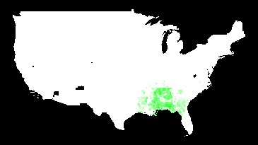
Counties won by Wallace in 1968
1972
Nixon was re-elected in a landslide. Not only was McGovern staunchly anti-war during the Vietnam War, he was criticized for his first choice of running mate (who he fired). The only obvious counties on this map that voted more for McGovern than for Humphrey were in McGovern’s home state of South Dakota:
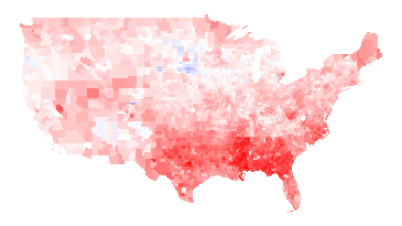
1972 (McGovern vs. Nixon) minus 1968 (Humphrey vs. Nixon)
1976
The Carter/Ford minus McGovern/Nixon map looks almost exactly the opposite, as the Watergate scandal destroyed Nixon’s and Ford’s standing. The South also rallied to Jimmy Carter, the first post-Civil War Southerner to be elected President.
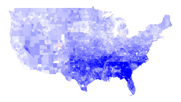
1976 (Carter-Ford) minus 1972 (McGovern-Nixon)
1980
Jimmy Carter had his own troubles: the economy was in dire shape, in large part because of the rise in gas prices because of the second oil crisis. Carter also was not a strong leader: my memory of the time is that he suffered from what I called “Democrat’s dilemma”: being able to see all sides to all issues and thus unable to take a strong stand. Ronald Reagan, who exuded a forceful, “can-do” attitude, was more successful than the disgraced Ford almost everywhere:
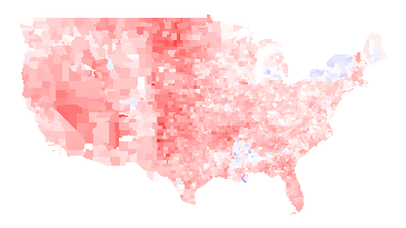
1980 (Carter vs. Reagan) minus 1976 (Carter vs. Ford)
1984
Reagan got even more popular in large swaths of the country. Mondale could only manage to erode some of Reagan’s support in spots.
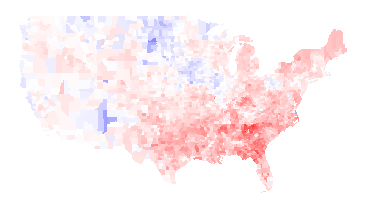
1984 (Mondale vs. Reagan) minus 1980 (Carter vs. Reagan)
Note that many of the blue counties above are areas of high Native American population. The map below shows counties where more than 30% of the people identify as Native Americans:

Counties with more than 30% Native American
I suspect that Reagan did something to upset Native Americans, but I don’t know what that was.
1988
George H.W. Bush was able to get elected in 1988, but he was pretty uniformly less successful than Reagan.
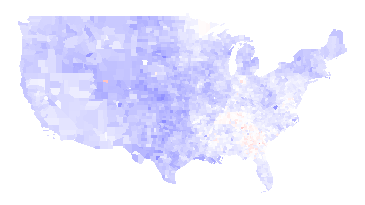
1988 (Dukakis vs. Bush41) minus 1984 (Mondale vs. Reagan)
1992
Bush continued to do worse in 1992, again pretty much across the whole country, losing to Clinton. Note that you can see the outline of Arkansas (home of Bill Clinton) clearly and Tennessee (home of Clinton’s VP Al Gore) somewhat.
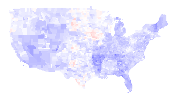
1992 (Clinton vs. Bush41) minus 1988 (Dukakis vs. Bush41)
Ross Perot made a strong third-party run in 1992. I’m not sure who he took more votes from.
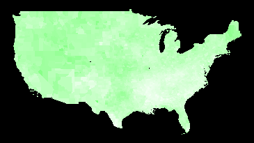
1992 third-party votes (mosty Perot)
1996
The Republicans made some inroads in 1996 in the West — especially in Bob Dole’s native Kansas (outline visible in the center of the country) — but it wasn’t enough. Clinton gained support in the upper Midwest, Northeast, Florida, Louisiana, and Southern Texas (which is heavily Latino).
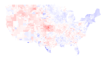
1996 (Clinton vs. Dole) minus 1992 (Clinton vs. Bush41)
2000
Bush43 and Gore had a famously close race, but Bush43 did better than Dole almost everywhere (or Gore did worse than Clinton, depending on how you look at it).
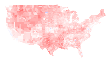
2000 (Gore vs. Bush43) minus 1996 (Clinton vs. Dole)
2004
Bush43 strengthened his lead in the middle and southeast of the country in 2004, but lost support in some Northern and Western places:
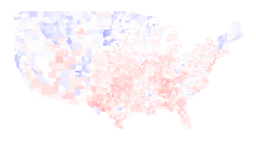
2004 (Kerry vs. Bush43) minus 2000 (Gore vs. Bush43)
I’ve written about the 2008 vs. 2004 map already, so I won’t talk about it here. Instead, I think it is interesting to compare the 2008 election to the 1960 election, to see how the country’s party affiliations have changed:

2008 (Obama vs. McCain) minus 1960 (Kennedy vs. Nixon)
The biggest difference is that the Southeast is much, much more Republican now (except for minority-heavy areas: the Black belt and parts of Florida).
The New England states and the upper Midwest are much more Democratic. Native Americans voted heavily for Obama. Most importantly, perhaps, is that the Pacific coastal areas are much, much more Democratic than they were in 1960. (Those areas have also experienced a great deal of population growth, so this change is bigger than it looks.) The only area that seems like it stayed sort of the same is a belt running through Mossouri, Illinois, Indiana, and Kansas.
Note: The difference maps aren’t up on my maps page yet, but they hopefully will be soon.
Best Webfoot Forward » Bush-Kerry, 2004 vs. 2008 layers added to map said,
April 13, 2009 at 6:21 pm
[…] Update: I did find better data! I blogged about it. […]
spacemika said,
April 14, 2009 at 7:17 pm
So, about the massively different intensity of the 2004 vs 2008 map vs all the other maps… Are all the maps to the same colour scale (ie, this particular shade of red represents the same thing in all the maps), or a sliding colour scale? If it’s all the same colour scalle, it looks like it’s one of the most intense changes of the lot.
I like your independent projects; it’s inspiring me to keep going with landslide models even after I finally submit the thesis.
ducky said,
April 14, 2009 at 11:02 pm
The Democratic/Republican maps (red->blue) maps are all at the same scale. (The additional info, the white->green maps, are at different scales because they show different things.)
Note that the very last map is not 2008 minus 2004, but 2008 minus 1960, so it isn’t actually very surprising that it has stark differences. (I’ll modify the text to make it more clear that I don’t show 2008 minus 2004.)
Other years do have strong colour changes, especially in the South as it whipsaws around.
Tamfang said,
December 2, 2010 at 2:21 pm
The Bureau of Indian Affairs is within the Department of the Interior, to which Reagan appointed James Watt, who was politely described as controversial. Wikipedia’s page on him mentions the word Indian only once (and Native not at all): “If you want an example of the failure of socialism, don’t go to Russia, come to America and go to the Indian reservations.”
So I don’t know either.