10.07.09
Median household income map done
I just added the median household income to a demographics map, and my oh my you see so much more at the census tract level than you do at the county level. (I recommend making it a bit more opaque to help you see better.)
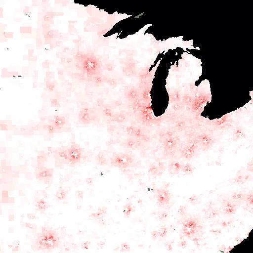
The map makes me think of mosquito bites: cities have a white center (low-income), surrounded by an angry red ring (the wealthy suburbs), with white again out in the rural areas:

In this image, full white is a median household income of $30,000 per year (in 1999 dollars), while full red is $150,000. Grey is for areas that the Census Bureau didn’t report a median income for — presumably because too few people lived there. The data is from the 2000 census.
