11.21.09
Australian maps
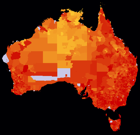
My friend Maciek Chudek and I entered two maps into the Mashup Australia contest: Shades of a Sunburnt People and Stimulating a Sunburnt People. The former shows information about the 2006 Australian Census:

Median age
Redder areas have a higher median age; gold areas are younger. (The red maxes out at 45 years old; any area with a median age of 25 or under is full gold.) Grey areas are ones which had so few people that the Australian Bureau of Statistics withheld the data for privacy reasons.
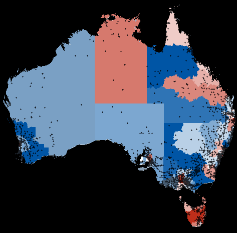
Our other map shows information about the rail, roads, and community infrastructure component of the Australian economic stimulus package:

Australian stimulus program spending
Blue areas are represented by the Australian Labor Party (which controls Parliament), and reddish areas are controlled by other parties. The darker the colour, the more money has been allocated. Dots represent individual projects. Like the Canadian economic stimulus package, we found a systematic bias favouring areas represented by the governing party.
Since these are so similar to my US census map and the Canadian stimulus map, you might think that this was totally straightforward to do. You might be wrong. We did quite a bit of massaging the data to get it out, and Maciek did a lot of analysis of the stimulus information.
