04.18.13
Variably-sized points on maps
The Huffington Post made a very nice interactive map of homicides and accidental gun deaths since the shooting at Sandy Hook. It’s a very nice map, but has the (very common problem) that it mostly shows where the population density is high: of course you will have more shootings if there are more people.
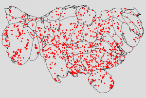
I wanted to tease out geographical/political effects from population density effects, so I plotted the gun deaths on a population-based cartogram. Here was my first try. (Click on it to get a bigger image.)
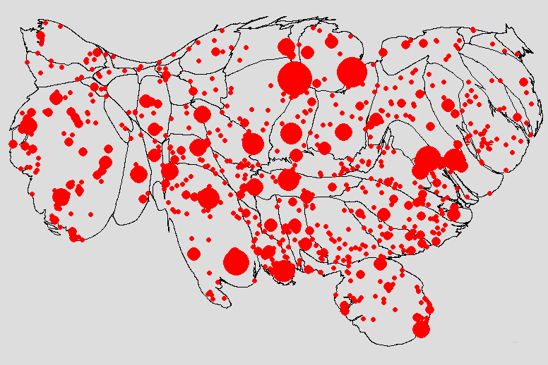
Unfortunately, the Huffington Post data gives the same latitude/longitude for every shooting in the same city. This makes it seem like there are fewer deaths in populated areas than there really are. So for my next pass, I did a relatively simple map where the radius of the dots was proportional to the square root of the number of gun deaths (so that the area of the dot would be proportional to the number of gun deaths).
This also isn’t great. Some of the dots are so big that they obscure other dots, and you can’t tell if all the deaths were in one square block or spread out evenly across an entire county.
For the above map, for New York City, I dug through news articles to find the street address of each shooting and geocoded it (i.e. determined the lat/long of that specific address). You can see that the points in New York City (which is the sort of blobby part of New York State at the south) seem more evenly distributed than for e.g. Baltimore. Had I not done that, there would have been one big red dot centered on Manhattan.
(Side note: It was hugely depressing to read article after article about people’s — usually young men’s — lives getting cut short, usually for stupid, stupid reasons.)
I went through and geocoded many of the cities. I still wasn’t satisfied with how it looked: the size balance between the 1-death and the multiple-death circles looked wrong. It turns out that it is really hard — maybe impossible — to get area equivalence for small dots. The basic problem is that with radiuses are integers, limited by pixels. In order to get the area proportional to gun deaths, you would want the radius to be proportional to the square root of the number of gun deaths, or {1, 1.414, 1.732 2.0, 2.236, 2.449, 2.645, 2.828, 3.000}, the rounded numbers will be {1, 1, 2, 2, 2, 2, 3, 3, 3}; instead of areas of {pi, 2*pi, 3*pi, 4*pi, …}, you get {pi, pi, 4*pi, 4*pi, 4*pi, 9*pi, 9*pi, 9*pi}.
Okay, fine. We can use a trick like anti-aliasing, but for circles: if the square root of the number of gun deaths is between two integer values (e.g. 2.236 is between 2 and 3), draw a solid circle with a radius of the just-smaller integer (for 2.236, use 2), then draw a transparent circle with a radius of the just-higher integer (for 2.236, use 3), with the opacity higher the closer the square root is to the higher number. Sounds great in theory.
In practice, however, things still didn’t look perfect. It turns out that for very small dot sizes, the dots’ approximations to circles is pretty poor. If you actually zoom in and count the pixels, the area in pixels is {5, 13, 37, 57, 89, 118, 165, …} instead of what pi*R^2 would give you, namely {3.1, 12.6, 28.3, 50.3, 78.5, 113.1, 153.9, …}.
But wait, it’s worse: combine the rounding radiuses problem with the problem of approximating circles, and the area in pixels will be {5, 5, 13, 13, 13, 13, 37, 37, 37, …}, for errors of {59.2%, -60.2% -54.0% -74.1% -83.4% -67.3% -76.0%, …}. In other words, the 1-death dot will be too big and the other dots will be too small. Urk.
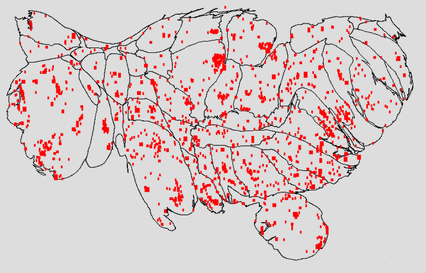
Using squares is better. You still have the problem of the rounding the radius, but you don’t have the circle approximation problem. So you get areas in pixels of {1, 1, 4, 4, 4, 9, 9, 9, …} instead of {1, 2, 3, 4, 5, 6, 7, 8, …} for errors of {0.0%, -50.0%, 33.3%, 0.0%, -20.0%, -33.3%, 28.6%, …} which is better, but still not great.
Thus: rectangles:
Geocoding provided by GeoCoder.ca


