02.17.06
Posted in Maps, Random thoughts at 10:38 am by ducky
I’ve found some interesting things with my maps.
It is easy to find:
I was also surprised to see
Permalink
02.16.06
Posted in Maps, Technology trends at 10:40 pm by ducky
I have been working on a Google maps mashup that has been a lot of work. While I might be able to get some benefit from investing more time and energy in this, I kept thinking to myself, “Google could do this so much better themselves if they wanted to. They’ve got the API, they’ve got the bandwidth, they’ve got the computational horsepower.”
Here’s what I’d love to see Google do:
- Make area-based mashups easier. Put polygon generation in the API. Let me feed you XML of the polygon vertices, the data values, and what color mapping I want, and draw it for me. (Note that with version 2 of the API, it might work to use SVG for this. I have to look into that.)
- Make the polygons first-class objects in a separate layer with identities that can feed back into other forms easily. Let me roll over a tract and get its census ID. Let me click on a polygon and pop up a marker with all the census information for that tract.
- Make it easy to combine data from multiple sources. Let me feed you XML of census tract IDs, data values, and color mapping, and tell you that I want to use census tract polygon information (or county polygons, or voting precinct polygons, or …) from some other site, and draw it for me.
- Host polygon information on Google. Let me indicate that I want census tract polygons and draw them for me.
- Provide information visualization tools. Let me indicate that I want to see population density in one map, percent white in another, median income in a third, and housing vacancy rates in a fourth, and synchronize them all together. (I actually had a view like that working, but it is computationally expensive enough that I worry about making it available.) Let me do color maps in two or three dimensions, e.g. hue and opacity.
- Start hosting massive databases. Start with the Census data, then continue on to the Bureau of Labor Statistics, CIA factbook information, USGS maps, state and federal budgets, and voting records. Sure, the information is out there already, but it’s in different formats in different places. Google is one of the few places that has the resources to bring them all together. They could make it easy for me to hook that data easily into information visualization tools.
- Get information from other countries. (This is actually tricky: sometimes governments copyright and charge money for their official data.)
Wouldn’t it be cool to be able to show an animation of the price of bread divided by the median income over a map of Europe from ten years before World War II to ten years after?
So how would Google make any money from this? The most obvious way would be to put ads on the sites that display the data.
A friend of mine pointed out that Google could also charge for the data in the same way that they currently charge for videos on Google Video. Google could either charge the visualization producers, who would then need to extract money from their consumers somehow, or they could charge the consumers of the visualizations.
Who would pay for this information? Politicians. Marketers. Disaster management preparedness organizations. Municipal governments. Historians. Economists. The parents of seventh-graders who desperately need to finish their book report. Lots of people.
Permalink
Posted in Hacking, Maps at 9:40 pm by ducky
I spent essentially all day today working on my Google Maps / U.S. Cenus mashups (instead of working on my Parallel Algorithms homework like I should have).
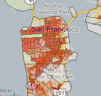
I think it’s pretty cool — I can display a lot of different population-based data overlaid on Google Maps. Here’s a piece of the population density overlay around San Francisco:

You can see Golden Gate park, The Presidio, golf courses, and the commercial district as places where people don’t live.
To the best of my knowledge, this is one of the first area-based Google Maps mashups, and depending on how strict your definition is, it might be the first area-based mashup. (This is opposed to the many point-based mashups, where there are markers at specific points.)
(Addendum: After I wrote the above, someone pointed out area-based satellite reception map. So now I have to say that mine is the probably the first shaded area-based display.)
There might be a good reason why there aren’t many area-based mashups: it’s computationally quite expensive. I’m actually a bit nervous about the possibilities of a success experience. I might really trash my server if a lot of people start banging on it.
I have ideas of how to make it less computationally intensive, including caching data, but it’s not as straightforward as you might think. For example, to precompute and store all of the tiles in the US would take (by my back-of-the-envelope calculation) on the order of 1000G. In expert mode, a user can choose between 36 numerators and 5 denominators for 180 different maps. Furthermore, there are an infinite number of different color mappings that the user could want. That’s more storage space than I want to pay for.
I thought about maybe drawing the polygon information once, and basically filling in the colors later. However, the database lookups are themselves quite intensive. There are 65,677 census tracts in the US. The polygons representing those tracts have 3.5 million vertices between them, but I’m already approximating somewhat: if the pixel area of a tract is too small, I only draw the bounding box of the tract instead of every corner.
I probably want to cache tiles in order of use. That’s pretty simple and straightforward, but I will have to then figure out a caching strategy for getting rid of tiles, or else buy lots and lots and lots of disk space.
Something else that would help a lot would be if people could switch data overlays without losing their lat/long/zoom place. I think I should be able to put links in the sidebar that get dynamically updated whenever the map center changes.
However, all of these things take some time, and I’m getting anxious about how I’ve been neglecting my schoolwork to play with the maps. The maps are more fun.
Permalink

