11.15.13
Cartographic “suicide caucus” map
Ryan Lizza posted an article and map in the New York Times which showed the locations of the US Congressional Districts whose Representatives backed the US federal government’s shutdown in an attempt to defund Obamacare. Here is a version of the map which I made, with yellow for the “suicide caucus”:
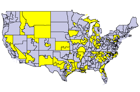
The article and map were good. I liked them. But there’s a real danger when looking at a map that you will — consciously or unconsciously — mentally equate the relative number of pixels on a map into the relative number of people.
Unfortunately, the geographical distribution of people is wildly, wildly uneven: from 0.04 people per square mile in the Yukon-Koyukuk Borough to more than 70,000 people per square mile in Manhattan. Yes, there are 1.75 MILLION more people per square mile in Manhattan than rural Alaska.
The map above makes it look like a higher percentage of congresspeople supported the shutdown than actually did. If you look at the shutdown districts on a cartogram — a map where the area of a congressional is distorted to be proportional to the population of that district — instead, it becomes even more clear just how few representatives were involved.

I have made a web page where you can explore congressional districts yourself.
In addition to seeing the maps above, you can also see thematic maps (both cartogram and regular) of
- percent without insurance
- percent white
- median family income
- median gross rent
- median home value
- percent living in poverty
- percent of children living in poverty
- percent of elderly living in poverty
- median age
- congressional election results from 2012
Additionally, if you click on a congressional district, you can see who represents that district, plus all of the above values for that district. If you click on the map away from a congressional district, you can see a table comparing the shutdown districts with the non-shutdown districts.
You can also look at maps for the presidential 2012 election results and seasonally-adjusted unemployment, but because those are county-based figures, you can’t do a strict comparison between shutdown/non-shutdown districts, so they aren’t in the comparison table or the per-district summaries.
Implementation notes
I used ScapeToad to generate the cartograms. It was a lot of trial and error to figure out settings which gave good results. (For those of you who want to make cartograms themselves: I defined cartogram parameters manually, and used 6000 points for the first grid, 1024 for the second, and 3 iterations.)
I used QGIS and GRASS to clean it up afterward (to remove slivers and little tiny holes left between the districts sometimes) and to merge congressional districts to make cartogram shapes.
NB: I use the state boundaries which I created by merging the cartogramified congressional districts, even for the maps which are based on counties (e.g. unemployment and the presidential results). It is pretty impressive how well the merged congressional district state boundaries match the county cartogram state borders. It wasn’t at all obvious to me that would happen. You could imagine that ScapeToad might have been more sensitive to the shapes of the counties, but somehow it all worked. Kudos to ScapeToad!
At some zoom levels, not all the district boundaries get drawn. That’s because I don’t want the map to be all boundary when way zoomed out, so I check the size before drawing boundaries. If the jurisdiction is too small, I don’t draw the boundary.
As a starting point, I used the Congressional District shapefiles from the US Census Bureau. For the population used for generating the cartogram, I used the Census Bureau American Community Survey 2011 values. For the other map attributes, I specify the source right under the “Color areas by”.
I made the map tiles myself, using custom PHP code. You can read more about it in Optimizing Map Tile Generation. I came up with my own algorithm for showing city labels.

Larry Hosken said,
November 15, 2013 at 7:27 pm
> Unfortunately, the geographical distribution of people is wildly, wildly uneven
I don’t care what you think, I’m not moving to Wyoming. Nice maps, tho