11.17.13
City Labels on Maps
When I watched people look at my cartograms, I saw that they frequently had trouble figuring out which distorted shapes on the map corresponded to which shapes on the more familiar non-distorted maps they were familiar with.
Clearly, I needed to give them some reference points.
The first thing that I thought of doing was distorting Open Street Map tiles to match the cartographic distortion. That didn’t work out so well, and I decided that I could get 90% of the benefit just by showing city names.
The next thing I tried was to make tiles with city names on them. This turned out to be difficult because city names frequently crossed tile boundaries, and the city names were variable widths.
What worked: I made markers with custom icons, where the icon was an image of the city name, and placed the icons at the appropriate location on the cartogram. This worked well: the city names moved with the background image when dragged, and creating the custom icons was quite lightweight.
Having solved how to show city names, I then needed to figure out when to show city names. Clearly I should show bigger cities first, but if you zoom in, you want to see smaller cities. I don’t know how Google does it, but they probably can afford to decide on a city-by-city basis at which zoom level that city should appear, but there are an awful lot of cities and an awful lot of zoom levels, and my name’s not Google. I can’t afford to do that.
I experimented with coming up with a formula to specify what population threshold to use for which zoom level, but I was unsatisfied with that. I couldn’t find a formula which would show enough cities in lightly-populated areas but not too many in densely populated areas.
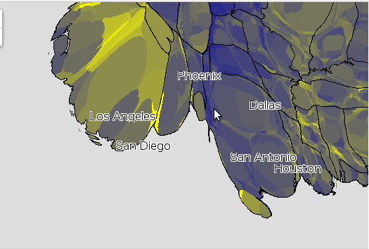
The next thing I tried was to figure out which area of the map was showing, and to label only the top six (by population) visible cities. This means that you see only really big cities when zoomed out a lot:
But when you zoom in (or move so that one of the labelled cities stops being in the view), more cities appeared:
(When I did this, I was surprised to find out how small (in population) some major cities are. Jacksonville, FL is bigger than Miami. Indianapolis is bigger than Boston. El Paso is bigger than Seattle. Now, partly that’s because I’m labelling cities and not metro areas, but it still surprised me.)
Even only showing six, there were still times when the cities names got crowded. Also, when way zoomed out, big sections of the country didn’t have any labels. What I finally did was look at the top 23 visible cities, and if there was a larger city nearby (in pixels), I skipped the smaller city. This seems to work really well:
It sure beat keeping a list of which cities to show at which zoom level!


Best Webfoot Forward » Cartographic “suicide caucus” map said,
November 17, 2013 at 6:38 pm
[…] I made the map tiles myself, using custom PHP code.  You can read more about it in Optimizing Map Tile Generation.  I came up with my own algorithm for showing city labels. […]