03.13.20
Posted in Canadian life, Politics, Random thoughts at 6:50 pm by ducky
On 22 Oct 1987, when the stock market crashed hard, I happened to be on the UCSB campus. I was surprised that the sun was out and people were smiling and laughing. I immediately realized that it was stupid to expect the world to turn black&white and bread lines to form immediately.
Still, that’s the place my brain jumped to.
I am having a similar odd disconnect right now. COVID-19 has been going for several months now, and yesterday there was widespread and somewhat sudden action in both the US and Canada.
Everything is going to be vastly changed for weeks, or months, maybe even a few years, and yet I see people walking blithely down the street, cars driving across the bridges, and joggers running on the seawall. Acting normal.
Meanwhile, I think about the last global pandemic, the Spanish Flu. When I was growing up (born in the 60s), I never heard about the Spanish Flu. It really wasn’t until the Web came along that I got the full story. Why didn’t anyone (like my grandparents, who were teenagers in 1918) talk about it before?
Maybe it was boring to them because everyone they knew had talked about it forever. I bet, however, it was because it was too traumatic. I know that I don’t like to discuss Trump’s election or the Iraq war because it is so painful for me.
And I wonder where that switch gets flipped. How does that transition happen? How will we go from today’s blitheness to it being too painful to talk about it?
I suspect the answer is “lots of trauma”. I’m not looking forward to that.
Permalink
03.11.18
Posted in Canadian life, Politics at 7:39 pm by ducky
I lead a group which is sponsoring a refugee family. Enough people have asked me how that works that I am compiling the answers here.
Legal Background
In Canada, there are three ways refugees come into the country:
- Government sponsored, where the federal government provides all of the financial support for the first year and contracts with organizations called settlement agencies to provide the logistical support and hopefully some emotional support as well. In BC, the main settlement agencies are MOSAIC and ISSBC.
- Blended Visa Office Referral, where a charitable organization (frequently churches) bring in a family who they don’t know. The organization — called a Sponsorship Agreement Holder or SAH — can do this by themselves or they can partner with a group of individuals (the sponsorship group), but the onus of vetting the sponsorship group and the legal liability lies with the SAH.
- The SAH periodically gets an anonymized list of families approved for resettlement in Canada. The entries usually give the family size, the ages of the children, sometimes the ages of the parents, their nationality, where they are now, if they have any special needs, and if there is a particular area they would like to go to. (For example, they might have a cousin in Calgary or might really want to live near the ocean.) The SAH communicates to the sponsorship group what families are available, and the sponsorship group will indicate if they are interested in sponsoring one of the family on the list. The SAH will then communicate with Immigration, Refugees and Citizenship Canada (IRCC); IRCC decides who “gets” the family if more than one SAH expressed interest.
- The SAH is legally responsible for 100% of the logistical and emotional support and slightly more than half of the financial support.
- If there is a sponsorship group, the sponsorship group is morally responsible for what the SAH is legally responsible for.
- The government provides 50% of the income support but not the start-up costs — furniture, staples, cleaning supplies, clothes, etc.
- Privately sponsored, where a group of at least five Canadian citizens and permanent residents (a “Group of Five”) OR a SAH enter into a legal agreement to bring in a family of known people. Under this sponsorship type, the group is 100% responsible for financial, logistical, and emotional support for the family for one year. (I call this the “let’s bring in grandma” sponsorship.)
Emotional and Logistical Support
I have mentioned emotional and logistical support multiple times. What do I mean by that?
As an example, since we got the news of when they were going to arrive, our team has:
- arranged temporary housing;
- gotten them a phone and cell plan;
- stocked their temporary housing with some food;
- found a permanent apartment;
- helped them fill out a massive number of forms (including the childcare tax credit and the medical services plan enrollment form);
- helped them get Social Insurance Numbers (analogous to the US Social Security Number);
- helped them open a bank account;
- gotten them winter coats;
- escorted the father to a medical appointment;
- showed them how to use their debit cards to buy transit cards;
- took them shopping for essentials (like underwear!);
- helped them phone their friends back in the camps;
- drove them to the local branch of their church;
- did a lot of talking, orienting, and many other details too minor to call out explicitly.
In the next few days, we will:
- co-sign the lease on their apartment;
- move donated furniture from at least four different places into the apartment;
- help them buy a small amount of furniture;
- help them buy groceries and cleaning supplies;
- help them register their child for school;
- help them register for English classes;
- show them how to use public transit;
- help them get library cards;
- help them get to eye and dental exams.
Longer-term, we will check in periodically to make sure they are adjusting well and give help as needed (e.g. to help mediate disputes or help them find trauma counseling if required), and help them find jobs.
Our particular experience
At the height of the publicity about the civil war in Syria, in late 2015, there was a huge outpouring of support for Syrian refugees. I was not immune, and posted quietly on Facebook that I was thinking of sponsoring a family and immediately got a huge response. Some people pledged money but couldn’t pledge time (because they lived elsewhere and/or had other obligations); some people pledged both.
I researched what was required and discovered that, because we didn’t know anybody personally, BVOR looked like the way to go. I looked through the list of SAHs and found that the Canadian Unitarian Council (CUC) was a SAH that I thought would be easy for me to work with, so I started working with the Unitarian Church of Vancouver (UCV)’s Refugee Committee.
I had to prove to the UCV Refugee Committee that we were trustworthy, including routing at least 2/3 of the required funds to UCV before they would advise CUC to accept us. (We put 100% of the amount, which helped show we were trustworthy.) We also had to fill out some forms for CUC.
Unfortunately, by the time we got our act together in 2016, the Canadian government had let in as many refugees (45,000) as it had decided it was going to let in that year. In 2017, the government set the BVOR quota very low, reserving most of the spots for private sponsorships, which were mostly for family members of the Syrians who arrived in 2015 and 2016.
(In mid-2017, I happened to be standing next to a TV in a deli where some MP was getting interviewed. She said, “The number one question I get asked when I go back to my riding is, ‘Where are my Syrian refugees?'” So we were not the only team waiting.)
2018 was a new year with new quotas, however. Furthermore, the rest of the world had reminded Canada that Syria wasn’t the only place where things were bad. So the BVOR list started getting populated again with families from different places. There still weren’t a lot, but there were some.
So while in 2016 we planned on sponsoring a Syrian family of four, in January 2018 when we spotted an Eritrean family of three, we requested a match with them. The government confirmed the match, and we sent in our paperwork on 30 Jan 2018. On 2 Mar 2018, we got word that they would arrive on 7 Mar 2018. Wheeee! It was a bit of a scramble.
“Our” family
I don’t want to say much about the family we are sponsoring because there are privacy/security concerns and because refugees are in a very vulnerable position, not knowing the country, culture, or language.
I think I can disclose that the family had been in a camp in country X for EIGHT years. (I am not clear on the details yet, but I think they might have been in a camp in country Y for a few years.) They were not allowed to leave the camp, so their child had NO memory of anything except that camp. There also were no TV or movies in the camp, so he didn’t even have any visual images of other places. I can’t even imagine what it was like for him to see grassy fields and forests and snow-covered mountains and airplanes and stoplights and microwave ovens.
Mom and Dad don’t produce much English, but they can understand some English. My husband has run errands with them with no translator, and by speaking slowly, directly, and simply, he can communicate.
Green Hills Welcoming Committee
Our team needed to have a name so that UCV could keep track of it as an entity, and we chose “Green Hills Welcoming Committee”.
Our time-donating team originally had six people on it. One dropped out because of health issues; one dropped out due to logistical issues. One husband has become more involved, and I picked up two team members from the UCV Refugee committee (including a former Eritrean refugee, who has contributed an enormous amount).
I have to say, we have an awesome team. We have worked very well together, encouraged each other, trusted each other, and come through for each other. We also have spread the load out so that no one person is overwhelmed.
- Person A has an infant, so is limited in how much she can do hands-on. She’s our researcher. She figured out which forms we needed and filled out as much as possible before the family got here (and documented everything she found). She’s made calls to figure out what we need to do to get the child enrolled in school and the parents enrolled in language classes.
- Person B and Person C are hosting them in their house. They have been taking care of hospitality things: feeding them, making them feel welcome, entertaining the child, etc.
- Person D, the former refugee, has been doing the translating and introducing them to the local community. (For example, he went to church with them.) He’s also been doing the lion’s share of ferrying them from one place to another and helped a lot in the housing search.
- Person E has been doing the bulk of the housing search, with significant help from Person D.
- Person F has been doing a lot of the helping and coaching for things involving bureaucracy. Person A got the forms ready and Person D can translate, but Person F is the one who has done the follow-through and gotten the forms signed and in the mail, and negotiated with the bureaucrats. He’s also taken the family on errands when Person D wasn’t available.
- Person G — the treasurer of the UCV refugee committee — has been the advisor. She’s always been there to give advice on how to handle things or explain how something has to be done.
The timing is also really really fortunate: only one team member has a day job. One has a night job, one is retired, one is on maternity leave, and three are between jobs/contracts. (Myself, I got laid off on 15 Feb.)
So far, so good.
Permalink
11.21.09
Posted in Politics at 1:48 pm by ducky
Sarah Palin is, you might have noticed, a very polarizing politician. Liberals are absolutely flummoxed that anybody could like her. Conservatives can’t understand why anyone wouldn’t like her. I think that Sarah Palin shows up a fundamental difference in values between liberals and conservatives: conservatives value right-brain thinking and liberals don’t.
As I have posted before, Jonathan Haight found that liberals and conservatives place different weights on aspects of morality. Liberals weight fairness much more highly than conservatives, for example, and conservatives weight what Haight calls “purity” much more highly than liberals. “Purity” is IMHO a poor term for it: “gut instinct” is probably a better term. It’s getting the feeling that something is wrong or right. This is a right-brain function.
Our educational system works hard to get people to stop listening to their gut, to process with the logical, procedural, lingual left-brain side. There are good pedagogical reasons for this: the right brain is fundamentally non-lingual, so it is difficult (if not impossible!) to explain right-brain decisions, to examine the decisions for errors in reasoning or assumptions, or to grade right-brain reasoning. The right brain can only communicate its conclusions with feelings, with “gut instincts”.
The right-brain does not communicate its decisions well, but that doesn’t mean that its processing is invalid. There are many things that the right brain can do that the left brain cannot. You cannot derive a great song, deduce that your spouse loves you, or prove that that figure a block away is your cousin Chris. People who make decisions only with the left-brain, only with facts and logic are more vulnerable to errors in the models or starting assumptions. (One might argue that the entire mortgage meltdown came from an over-reliance on left-brain reasoning and paying inadequate attention to the little voices saying, “waitaminute — can this really work?”)
If you value right-brain processing, then the political climate for you must be very frustrating. Liberals don’t even pay lip service to right-brain processing: it is so non-valued that it is a complete blind spot for them. (If Obama was any more left-brain, he’d fall over.) I can imagine that it would also be scary to see your beautiful country in the hands of people who apparently are paying no attention at all to their gut.
Sarah Palin is total right-brain. Here is what she said when asked when Bill O’Rielly asked her if she was smart enough to be president:
I believe that I am because I have common sense, and I have, I believe, the values that are reflective of so many other American values. And I believe that what Americans are seeking is not the elitism, the kind of a spinelessness that perhaps is made up for that with some kind of elite Ivy League education and a fact resume that’s based on anything but hard work and private sector, free enterprise principles. Americans could be seeking something like that in positive change in their leadership. I’m not saying that has to be me.
Nothing in her answer has to do with left-brain facts or logic, and in fact she skewers left-brain training (“elite … education” and “a fact resume”). She is also completely unapologetic about being right-brained; instead of being guilty and ashamed of it, she gets angry and frustrated at her critics. This is a high-status behaviour, and people think that high-status people do good things, as I have posted about before.
Meanwhile, liberals look at her left-brain abilities and are appalled. They find fault with her left-brain abilities, as evidenced by what they see as her rhetorical weaknesses: her inability to marshal facts into the type of coherent, rhetorically logical arguments that they favour. They do not value her right-brain rhetorical abilities — her ability to reach people’s “guts” — because they do not value right-brain skills. The conservatives are less bothered by her weakness in left-brain skills because they do not value left-brain skills as much.
The left also remembers G. W. Bush, who was also very right-brain, going on gut and instinct. They think that his instincts were frequently wrong (e.g. Iraq did not have weapons of mass destruction) with disastrous consequences. So to some extent, they are punishing Sarah Palin for what they saw as G. W. Bush’s mistakes.
Note: I have been somewhat loose with the terms “liberal” and “conservative” here. While I think there are probably not very many right-brain liberals, there are left-brain conservatives. Andrew Sullivan is clearly a left-brain conservative, and Sarah Palin clearly drives him absolutely nuts.
Permalink
10.26.09
Posted in Canadian life, Politics at 1:29 pm by ducky
Update: Some of the ridings were assigned to neighbouring ridings due to losing some precision in the input lat/lng. This did not make a big difference in the overall picture, as only 2.7% of the projects were classified incorrectly. I’ve updated this blog posting and the map; we probably won’t update the spreadsheet unless we have strong requests to do so.
There has been a fair amount of press lately on the distribution of Canadian stimulus money, with most of what we’d heard saying that Conservative ridings were getting more than their fair share of stimulus money e.g. The Globe and Mail’s Stimulus Program favours Tory ridings. Conservatives countered that it was important to look at the big picture, and that there were multiple stimulus programs. The National Post’s Liberal, NDP ridings getting more than fair share of infrastructure money: analysis reported that non-conservative ridings were getting more than their fair share of the Knowledge Infrastructure Program grants.
My husband and I kind of looked at each other and said, “We can analyze that data!”, so we did. We saw a bias in Conservative/non-Conservative ridings, but it wasn’t huge. We found that Conservative ridings got 51% of the projects, while only 46% of the ridings are Conservative. NDP ridings got 15% of the projects, despite only having 12% of the ridings, and even liberals got slightly more than “their fair share”, with 27% of the projects and only 25% of the ridings.
So who is getting less? The Bloc Québécois. With 15% of the ridings, the Bloc only got 6% of the projects.
If you look at the breakdown by province, it looks like Ontario is getting way, WAY more than its fair share, with some other provinces — especially Québec — getting less than their fair share.
| Province |
% of projects |
% of population |
| AB |
6.71 |
11 |
| BC |
9.2 |
13 |
| MB |
3.81 |
3.6 |
| NB |
3.05 |
2.2 |
| NF |
3.33 |
1.5 |
| NS |
4.20 |
1.8 |
| NT |
0.55 |
.13 |
| NU |
0.39 |
.094 |
| ON |
53.0 |
39 |
| PE |
1.7 |
.42 |
| QC |
8.2 |
23 |
| SK |
5.26 |
3.1 |
| YT |
0.53 |
0.1 |
Dollar values are much harder to estimate because the value of each of the projects is given as a range — “under $100K”, “between $100K and $1M”, etc. We made our best guesses at how to calculate that, and our best estimate gives Québec 12% of the dollars for 23% of the population — better, but still way less than they should be getting.
Now, there might be some errors in the data, as described below. However, we think that this is worth investigation, and soon.
If you would like to look at the data yourself, Jim put together a spreadsheet in Open Office format, a slightly less-powerful spreadsheet in Excel format, and a PDF showing information from the spreadsheet, available on his writeup of the data. I of course made a map of the data.
Caveats:
- We are in no way affiliated with the Government of Canda or Statistics Canada. This analysis does not represent government policy.
- There are multiple parts to the stimulus package, and this analysis only covers the infrastructure component. Other money in the stimulus plan is going towards improving the financial system (which I think means “bank bailouts”, but I’m not sure), extending unemployment benefits, etc.
- I assigned ridings based on the latitudes and longitudes that were given in the Economic Action Plan’s data (which Jim pulled down using their API). We have some doubts about the integrity of those lat/long pairs, especially since two of the stimulus projects have lat/longs that are unquestionably in the United States.
- My software truncated the latitude and longitude used to assign ridings down to two digits, which means the points can appear a little bit to the east and/or south of their actual location. In cases where a point is very near a riding border, that could mean that it would be assigned to the neighbouring riding. I expect this would only affect a very few ridings, and would not significantly affect the by-province counts. This made absolutely no difference in the riding assignment. Update: 174 ridings were mis-assigned, but this did not make a huge difference in the aggregate numbers. It meant that Conservative ridings got 51.1% of the projects instead of 52%, and Quebec got 8.2% instead of 8.6%. The message stays the same: there is inequity here.
- It might be that some national projects are assigned a lat/lng in Ontario because there wasn’t an obvious locus for the project. However, if that were the case, then I would expect that Ottawa would have the biggest number of projects. In fact, the most projects (144) are in the Vaughn riding in Toronto, represented by MP Hon. Maurizio Bevilacqua (L). The Ottawa Centre riding does have the second-highest, but only 101 projects out of the 6424 projects — not enough to explain why QC has so few projects.
Copyrights:
- Information on the stimulus project information came from Canada’s Economic Action Plan
- Canadian federal riding geometries came from Elections Canada, which requires this notice: © The federal Electoral Districts Boundaries (Representation Order 2003), Elections Canada. All rights reserved. Reproduced with the permission of Elections Canada, Ottawa, Ontario K1A 0M6 Canada (2007).
- Information on Canadian MPs came from the House of Commons Web site and were produced by the Government of Canada. The right to reproduce for non-commercial use is given here.
- Provincial population figures came from Statistics Canada.
Update: I looked at per-capita figures, and that makes things look even more skewed. Five of the top ten ridings in projects per hundred thousand people are in Ontario:
| Kenora, ON |
|
132.211 |
| Algoma—Manitoulin—Kapuskasing, ON |
|
124.42 |
| Yukon, YT |
|
111.94 |
| Parry Sound—Muskoka, ON |
|
101.90 |
| Ottawa Centre, ON |
|
92.37 |
| Egmont, PEI |
|
91.91 |
| Vaughan, ON |
|
91.44 |
| Nunavut, NU |
|
84.82 |
| Western Arctic, NT |
|
84.41 |
| Labrador, NL |
|
79.65 |
The top riding in Quebec, by comparison, ranks 82th out of 308 ridings (at 29.9 projects per hundred thousand people).
(Note that ridings have roughly between 25 and 125 thousand people, with the average right around one hundred thousand.)
Permalink
05.10.09
Posted in Maps, Politics at 6:38 pm by ducky
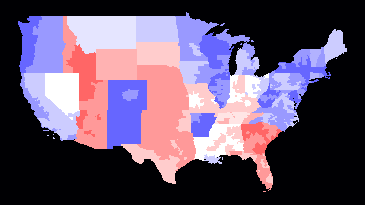
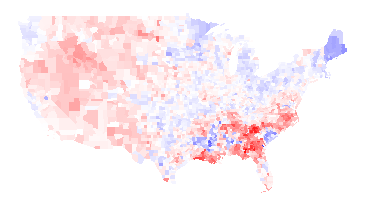
I added a state legislatures partisanship layer to my election map, and also modified a metric which shows kind of how liberal an area is. For every governor, US senator, or US congressman in a district that is a Democrat, I added one. For every legislator who is a Republican, I subtracted one. Now, with the new data, I also add one point for each state legislative chamber that is controlled by Democrats, and subtract one for each that is controlled by Republicans.
This gives me a range of -6 to plus 6 (governor, two US senators, one US congressman, one state senate, one state lower chamber), which I can show in shades of red to blue:

Some things are not surprising: the northeast is very blue; Idaho and Utah are very red. However, I don’t get Arkansas. I wouldn’t have thought that it would be culturally very different from its neighbours, yet most of the state has the maximum value of +6.
Is this all due to Clinton? Did he build a really strong Democratic Party operation in Arkansas? Or did he throw a bunch of money towards Arkansas, for which they are still grateful?
Can anyone familiar with Arkansas shed any light on this?
UPDATE:
A reader from Arkansas explained that the Arkansas Democratic party is very entrenched and strong, but that the populace is not particularly liberal. Essentially, people who are Democrats in Arkansas would be Republicans just about anywhere else. (This is similar to the Liberal Party in BC, which is the most conservative of the three viable parties in BC. The Liberal Party in BC is much more conservative than the Canadian federal Liberal party.)
Permalink
05.01.09
Posted in Politics at 8:47 am by ducky
CNN released a poll that showed that how often an American Christian goes to church corresponds strongly to how much he/she supports torture.
To a liberal, this makes no sense at all. The Golden Rule says to treat others as we would like to be treated ourselves, right? And most people would not want to be tortured, right? What’s the deal?
It makes sense to me in light of Haight’s findings on morality. The people who go to church the most often are those for whom belonging to a group is most important, which ties to in-group loyalty. I can imagine that as in-group loyalty increases, desire to protect the in-group gets fiercer. Meanwhile, I can imagine that as in-group loyalty increases, respect for/value of people in the out-group decreases. To put it another way, the higher your loyalty to people who look like you, I bet the less interested you are in preserving the rights of people who don’t look like you.
This is not my value structure.
Update: A friend pointed me to a study that shows that participation in religious rituals (but not how often they prayed) predicts support for suicide bombing! This was true across cultures — Palestinian Muslims, Israeli Jews, Mexican Catholic, Indian Hindus, Russian Orthodox Christians, UK Protestants, and Indonesian Muslims. Furthermore, in some of the interviews, they “primed” the interviewee to think about religious affiliation before asking about support for suicide bombing; that turned out to significantly increase reported support for suicide bombing!
This paper thus seems to me to pretty strongly support the CNN poll, albeit indirectly. It seems to me that it not a great leap to replace
- a suicide bomber from the in-group who kills members of the out-group
with
- a torturer from the in-group who tortures members of the out-group.
Permalink
04.24.09
Posted in Politics at 7:41 am by ducky
A few days ago, I read something somewhere about how disappointing it was that there wasn’t more hue and cry about the recent release of the torture memos. (Sorry, my computer died and I was somewhat off the air for a few days, so don’t have a citation.)
Initially, I wasn’t going to blog about the release of the memos, but I feel I have to go on the record. I feel I have to say something in order to be counted, to make the “torture bad” side of the argument one voice stronger.
Initially, I wasn’t going to blog because I didn’t think any more needed to be said. I’ve already discussed why I think torture is a bad idea. (Never mind discussions about it being morally wrong, it’s still just flat a bad idea.) The things that I said — that I thought it was impossible to keep our torturing a secret, impossible to only torture guilty people, and that torture gave faulty information — proved true well before the memos were released.
I was angry and saddened at my country’s cavalier treatment of our military prisoners even before the memos were released. I had already seen routine torture at Abu Ghraib, and it was already known that we had waterboarded some prisoners. To hear that we waterboarded one guy 183 times was appalling, but I was already appalled that we did it at all. The difference between someone who knocks over 90 year-olds for fun and one who doesn’t is far starker than one who knocks over three seniors over versus one who knocks over 183.
I was already angry and saddened at how many of my fellow citizens thought torture was a hunky-dory method; just one more tool in the toolchest for waging war. To hear that Peggy Noonan thought we should not have released the memos — that we should just avert our eyes and walk on by was jaw-dropping, but my jaw has been on the floor for a long time.
The only thing that has changed is my attitude towards prosecution. I had gone along with the argument that we shouldn’t spend political capital on dragging something along that would devolve into partisan bickering. After seeing how stunningly in denial the Right-Wing is about torture being illegal, immoral, and ineffective, I now think we have to prosecute. If we don’t — if we continue to let a large portion of the country think that torture is okay — then we will torture again.
This is not about retribution. This is not about vengence. This is not even about justice. This is about prevention. This is about deterrence. This is about making sure that my country never goes down that slippery slope again.
Permalink
04.19.09
Posted in Maps, Politics at 4:56 pm by ducky
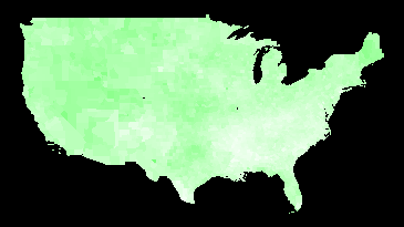
I have been looking at unemployment figures today. Here’s unemployment rate by county for 2008, from the Bureau of Labor Statistics. Pure white corresponds to a rate of 2%; pure green corresponds to a rate of 10%.

Unemployment Rate 2008
Note that the unemployment rate is dimensionless, i.e. it’s the number of people looking for work divided by the number of people in the workforce. The BLS makes its estimates by interviewing thousands of people each week and carefully asking them questions about their employment. If they have worked at all in the past week (even part-time), that counts as employed. If they haven’t looked for work in four weeks, they do not count as being in the workforce. This means that retired people, stay-at-home moms, and people who have given up do not count. (The BLS has a good explanation of their methods.)
Here is the unemployment rate by county for 2007:

Unemployment Rate 2007
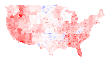
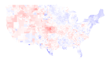
Again, I think the more interesting picture is the difference between the two years; red where unemployment has gone up, blue where unemployment has gone down. Full red means a change of +5 percentage points or more; full blue means a change of -5 percentage points or more.

2008 unemployment rate minus 2007 unemployment rate
There’s an awful lot of red there, alas. The unemployment rate fell in 272 counties and rose in 2767 counties.
Things worth noting about the above maps:
- There are a fair number of state boundaries visible in the 2008 minus 2007 map. For examples, Wisconsin is particularly visible, Wyoming is visible to a lesser extent, and there is also a line visible running along the north side of Oklahoma, Arkansas, Alabama, Mississippi, and South Carolina, and a line along the east side of Alabama. I think this means that state policies actually do matter.
- West Virginia had lower unemployment in 2008 than 2007. I presume that was demand for coal relating to the high price of oil in most of 2008. The Oklahoma drops in unemployment also be due to the higher value of oil; I don’t know why North Dakota did better.
- Woods County, OK, which is the bright blue spot in near the center of the country in the 2008 minus 2007 map, has a relatively small population: 120 people were unemployed in 2008 versus 261 in 2007. Oklahoma’s economy has a large fossil fuel component.
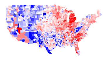
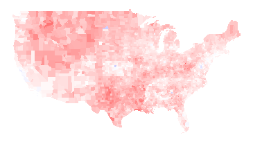
It’s also interesting to look at the difference between 2008 and 1998:

2008 unemployment rate minus 1998 unemployment rate
Thoughts:
- Poor Michigan.
- In addition to West Virginia, the rural West had higher unemployment in 1998 than in 2008. I presume this has to do with the very strong market for resources (trees, minerals, coal, etc.) for most of 2008.
I have added the first three maps to my elections map page. (Note that I have data such that I can put even more maps on the page, but I worry about the UI getting too cluttered. Thus, if you really want to see some map, let me know.)
Update: A friend of a friend pointed me at Wisconsin Business Climate Statistics. That page points out the Wisconsin has a very lean government, low taxes, low crime,and tax exemption for energy used in manufacturing. Frankly, it sounds like a Republican party platform — even though Wisconsin is a very Democratic-leaning state.
Permalink
04.13.09
Posted in Maps, Politics at 5:51 pm by ducky
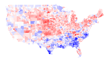
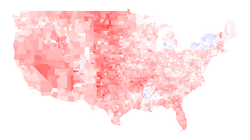
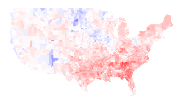
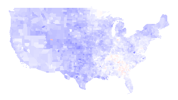
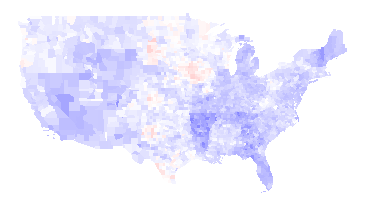
I recently got historical data on presidential election results by county from Robert Vanderbei, for presidential elections 1960-2004. While it is interesting to look at the raw data, I find it even more interesting to look at the differences between years, like the 2008 vs. 2004 map I commented on already. This helps separate how people felt about a particular pair of politicians from how liberal/conservative they are in general. For example, here’s the 1960 (Nixon vs. Kennedy) map, with Democratic counties in blue and Republican counties in red:

1960 -- Kennedy vs. Nixon
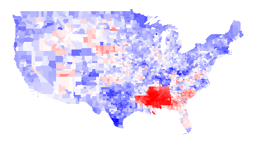
And here’s the 1964 (Johnson vs. Goldwater) map:

1964 -- Johnson vs. Goldwater
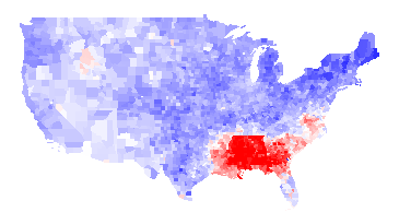
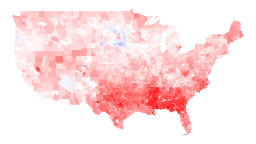
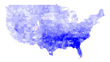
1964 Difference
You can see even from the 1964 map that LBJ was not very popular in the South (presumably because of his civil rights work), but the difference map below really hammers it home. In this map, it is blue if LBJ did better than Kennedy and red if the reverse. You can see from the difference map that the South really hated LBJ:

1964 results minus 1960 results
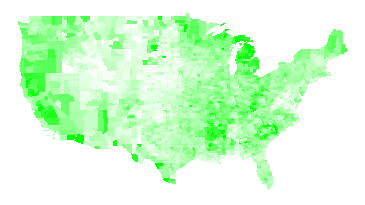
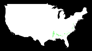
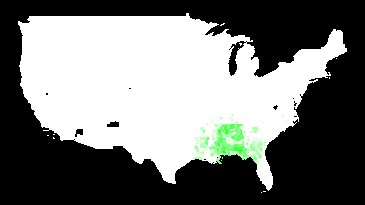
Another interesting thing about the 1960/1964 maps is that there is no evidence at all of “the black belt”. Here is a map of counties which were majority black in 2000, with darker green the stronger their majority:

Majority-black counties (2000)
I have to believe that blacks would have overwhelmingly voted for LBJ — if they were able. I think this is a pretty vivid demonstration of how thoroughly their voting rights were repressed.
1968 vs. 1960
The 1968 (McGovern-Nixon) minus 1964 map is basically an inverse of the 1964 minus 1960 map, basically because the southern antipathy towards Johnson was so strong that it skews everything. A more interesting map is to compare Humphrey vs. Nixon to Kennedy vs. Nixon:

1968 (Humphrey-Nixon) minus 1960 (Kennedy-Nixon)
Humphrey explicitly called for the Democrats to move away from states’ rights and towards civil rights, and that apparently played well in the upper Midwest and Northeast but not as well in the Southeast or West. You can also see a faint outline of Minnesota (where Humphrey was from) and a strong outline of Maine (where Muskie, the Democratic VP, was from). (Maryland, where Nixon’s VP Spiro Agnew was from, is too small to see in this picture.) You can maaaybe start to see the majority-black counties in some states, but not in Georgia.
There are some blue areas in the above map, but those probably would be red if it weren’t for George Wallace. Wallace ran as an independent, and did extremely well in southern states. It is unlikely that he took any votes away from Humphrey, as he was an outspoken proponent of segregation. While third-party candidates usually struggle to get over 10% of the vote, Wallace won a number of states outright. Here is a map of counties that he won outright:

Counties won by Wallace in 1968
1972
Nixon was re-elected in a landslide. Not only was McGovern staunchly anti-war during the Vietnam War, he was criticized for his first choice of running mate (who he fired). The only obvious counties on this map that voted more for McGovern than for Humphrey were in McGovern’s home state of South Dakota:

1972 (McGovern vs. Nixon) minus 1968 (Humphrey vs. Nixon)
1976
The Carter/Ford minus McGovern/Nixon map looks almost exactly the opposite, as the Watergate scandal destroyed Nixon’s and Ford’s standing. The South also rallied to Jimmy Carter, the first post-Civil War Southerner to be elected President.

1976 (Carter-Ford) minus 1972 (McGovern-Nixon)
1980
Jimmy Carter had his own troubles: the economy was in dire shape, in large part because of the rise in gas prices because of the second oil crisis. Carter also was not a strong leader: my memory of the time is that he suffered from what I called “Democrat’s dilemma”: being able to see all sides to all issues and thus unable to take a strong stand. Ronald Reagan, who exuded a forceful, “can-do” attitude, was more successful than the disgraced Ford almost everywhere:

1980 (Carter vs. Reagan) minus 1976 (Carter vs. Ford)
1984
Reagan got even more popular in large swaths of the country. Mondale could only manage to erode some of Reagan’s support in spots.

1984 (Mondale vs. Reagan) minus 1980 (Carter vs. Reagan)
Note that many of the blue counties above are areas of high Native American population. The map below shows counties where more than 30% of the people identify as Native Americans:

Counties with more than 30% Native American
I suspect that Reagan did something to upset Native Americans, but I don’t know what that was.
1988
George H.W. Bush was able to get elected in 1988, but he was pretty uniformly less successful than Reagan.

1988 (Dukakis vs. Bush41) minus 1984 (Mondale vs. Reagan)
1992
Bush continued to do worse in 1992, again pretty much across the whole country, losing to Clinton. Note that you can see the outline of Arkansas (home of Bill Clinton) clearly and Tennessee (home of Clinton’s VP Al Gore) somewhat.

1992 (Clinton vs. Bush41) minus 1988 (Dukakis vs. Bush41)
Ross Perot made a strong third-party run in 1992. I’m not sure who he took more votes from.

1992 third-party votes (mosty Perot)
1996
The Republicans made some inroads in 1996 in the West — especially in Bob Dole’s native Kansas (outline visible in the center of the country) — but it wasn’t enough. Clinton gained support in the upper Midwest, Northeast, Florida, Louisiana, and Southern Texas (which is heavily Latino).

1996 (Clinton vs. Dole) minus 1992 (Clinton vs. Bush41)
2000
Bush43 and Gore had a famously close race, but Bush43 did better than Dole almost everywhere (or Gore did worse than Clinton, depending on how you look at it).

2000 (Gore vs. Bush43) minus 1996 (Clinton vs. Dole)
2004
Bush43 strengthened his lead in the middle and southeast of the country in 2004, but lost support in some Northern and Western places:

2004 (Kerry vs. Bush43) minus 2000 (Gore vs. Bush43)
I’ve written about the 2008 vs. 2004 map already, so I won’t talk about it here. Instead, I think it is interesting to compare the 2008 election to the 1960 election, to see how the country’s party affiliations have changed:

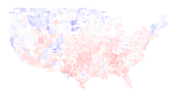
2008 (Obama vs. McCain) minus 1960 (Kennedy vs. Nixon)
The biggest difference is that the Southeast is much, much more Republican now (except for minority-heavy areas: the Black belt and parts of Florida).
The New England states and the upper Midwest are much more Democratic. Native Americans voted heavily for Obama. Most importantly, perhaps, is that the Pacific coastal areas are much, much more Democratic than they were in 1960. (Those areas have also experienced a great deal of population growth, so this change is bigger than it looks.) The only area that seems like it stayed sort of the same is a belt running through Mossouri, Illinois, Indiana, and Kansas.
Note: The difference maps aren’t up on my maps page yet, but they hopefully will be soon.
Permalink
03.14.09
Posted in Canadian life, Gay rights, Politics at 9:40 am by ducky
Recently, the California Supreme Court heard arguments in a case designed to overturn California’s Proposition 8, which overturned the judicial decision that gay and lesbian people had the right to marry. While I didn’t watch the hearings myself, I understand that Ken Starr (the defending attorney) basically put forth the belief that a majority vote could strip rights of minority.
People who are better than I at guessing what the outcome will be by examining the questions, tone, and body language of the justices think that they will rule against overturning Proposition 8, in part because they think that the California Domestic Partnership gives all of the same rights as marriage. Essentially, they are fighting over a word, with Starr’s side saying that a bare majority of the citizens can take away gay and lesbian people’s right to use the word “marriage”.
There was a Canadian political figure, Stockwell Day, who seemed to have similar beliefs in the rights of the majority over the rights of a minority. He pushed for a law that would have required a referendum on any proposal supported by a petition signed by 3% of Canadian voters. He stopped talking about this when Rick Mercer (sort of Canada’s Jon Stewart) called for a national petition forcing Stockwell Day to change his first name to “Doris”.
Perhaps the correct response to Proposition 8 is to put a constitutional amendment on the ballot requiring Ken Starr to change his first name to “Brenda”.
Permalink
« Previous entries Next Page » Next Page »
