04.21.09
Posted in Canadian life, Hacking, University life at 11:47 am by ducky
The UBC programming team took 34th place at the 2009 International Collegiate Programming Contest (ICPC) World Finals in Stockholm! W00t!!
This marks the sixth year in a row that UBC has gone to the World Finals, despite being entirely undergraduates and entirely without World Finals experience. (We have information on past teams, but don’t know the seniority of the 2004 team.)
Congratulations, team!
Permalink
04.19.09
Posted in Maps, Politics at 4:56 pm by ducky
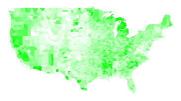
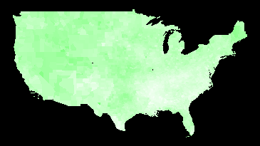
I have been looking at unemployment figures today. Here’s unemployment rate by county for 2008, from the Bureau of Labor Statistics. Pure white corresponds to a rate of 2%; pure green corresponds to a rate of 10%.

Unemployment Rate 2008
Note that the unemployment rate is dimensionless, i.e. it’s the number of people looking for work divided by the number of people in the workforce. The BLS makes its estimates by interviewing thousands of people each week and carefully asking them questions about their employment. If they have worked at all in the past week (even part-time), that counts as employed. If they haven’t looked for work in four weeks, they do not count as being in the workforce. This means that retired people, stay-at-home moms, and people who have given up do not count. (The BLS has a good explanation of their methods.)
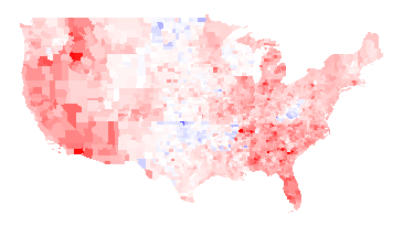
Here is the unemployment rate by county for 2007:

Unemployment Rate 2007
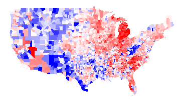
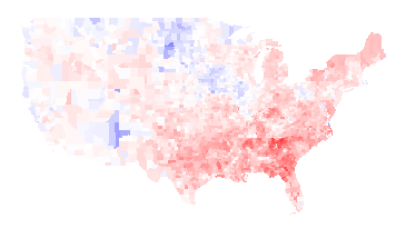
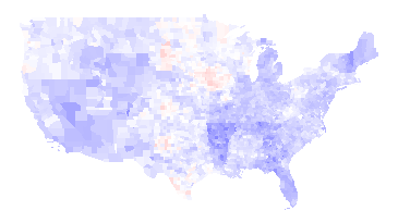
Again, I think the more interesting picture is the difference between the two years; red where unemployment has gone up, blue where unemployment has gone down. Full red means a change of +5 percentage points or more; full blue means a change of -5 percentage points or more.

2008 unemployment rate minus 2007 unemployment rate
There’s an awful lot of red there, alas. The unemployment rate fell in 272 counties and rose in 2767 counties.
Things worth noting about the above maps:
- There are a fair number of state boundaries visible in the 2008 minus 2007 map. For examples, Wisconsin is particularly visible, Wyoming is visible to a lesser extent, and there is also a line visible running along the north side of Oklahoma, Arkansas, Alabama, Mississippi, and South Carolina, and a line along the east side of Alabama. I think this means that state policies actually do matter.
- West Virginia had lower unemployment in 2008 than 2007. I presume that was demand for coal relating to the high price of oil in most of 2008. The Oklahoma drops in unemployment also be due to the higher value of oil; I don’t know why North Dakota did better.
- Woods County, OK, which is the bright blue spot in near the center of the country in the 2008 minus 2007 map, has a relatively small population: 120 people were unemployed in 2008 versus 261 in 2007. Oklahoma’s economy has a large fossil fuel component.
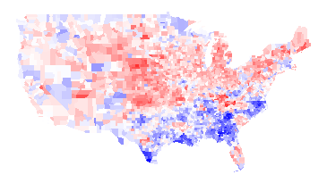
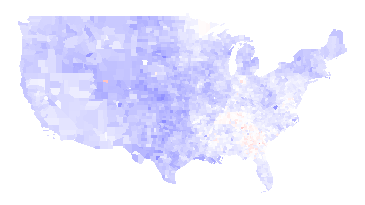
It’s also interesting to look at the difference between 2008 and 1998:

2008 unemployment rate minus 1998 unemployment rate
Thoughts:
- Poor Michigan.
- In addition to West Virginia, the rural West had higher unemployment in 1998 than in 2008. I presume this has to do with the very strong market for resources (trees, minerals, coal, etc.) for most of 2008.
I have added the first three maps to my elections map page. (Note that I have data such that I can put even more maps on the page, but I worry about the UI getting too cluttered. Thus, if you really want to see some map, let me know.)
Update: A friend of a friend pointed me at Wisconsin Business Climate Statistics. That page points out the Wisconsin has a very lean government, low taxes, low crime,and tax exemption for energy used in manufacturing. Frankly, it sounds like a Republican party platform — even though Wisconsin is a very Democratic-leaning state.
Permalink
04.13.09
Posted in Maps, Politics at 5:51 pm by ducky
I recently got historical data on presidential election results by county from Robert Vanderbei, for presidential elections 1960-2004. While it is interesting to look at the raw data, I find it even more interesting to look at the differences between years, like the 2008 vs. 2004 map I commented on already. This helps separate how people felt about a particular pair of politicians from how liberal/conservative they are in general. For example, here’s the 1960 (Nixon vs. Kennedy) map, with Democratic counties in blue and Republican counties in red:

1960 -- Kennedy vs. Nixon
And here’s the 1964 (Johnson vs. Goldwater) map:

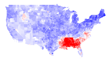
1964 -- Johnson vs. Goldwater
1964 Difference
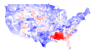
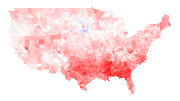
You can see even from the 1964 map that LBJ was not very popular in the South (presumably because of his civil rights work), but the difference map below really hammers it home. In this map, it is blue if LBJ did better than Kennedy and red if the reverse. You can see from the difference map that the South really hated LBJ:

1964 results minus 1960 results
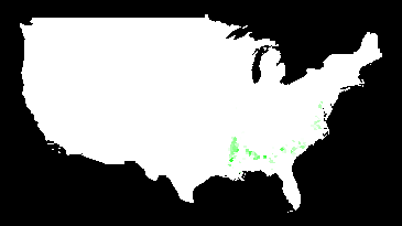
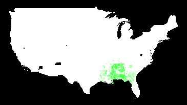
Another interesting thing about the 1960/1964 maps is that there is no evidence at all of “the black belt”. Here is a map of counties which were majority black in 2000, with darker green the stronger their majority:

Majority-black counties (2000)
I have to believe that blacks would have overwhelmingly voted for LBJ — if they were able. I think this is a pretty vivid demonstration of how thoroughly their voting rights were repressed.
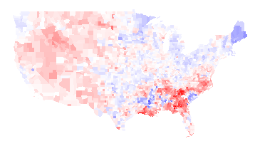
1968 vs. 1960
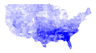
The 1968 (McGovern-Nixon) minus 1964 map is basically an inverse of the 1964 minus 1960 map, basically because the southern antipathy towards Johnson was so strong that it skews everything. A more interesting map is to compare Humphrey vs. Nixon to Kennedy vs. Nixon:

1968 (Humphrey-Nixon) minus 1960 (Kennedy-Nixon)
Humphrey explicitly called for the Democrats to move away from states’ rights and towards civil rights, and that apparently played well in the upper Midwest and Northeast but not as well in the Southeast or West. You can also see a faint outline of Minnesota (where Humphrey was from) and a strong outline of Maine (where Muskie, the Democratic VP, was from). (Maryland, where Nixon’s VP Spiro Agnew was from, is too small to see in this picture.) You can maaaybe start to see the majority-black counties in some states, but not in Georgia.
There are some blue areas in the above map, but those probably would be red if it weren’t for George Wallace. Wallace ran as an independent, and did extremely well in southern states. It is unlikely that he took any votes away from Humphrey, as he was an outspoken proponent of segregation. While third-party candidates usually struggle to get over 10% of the vote, Wallace won a number of states outright. Here is a map of counties that he won outright:

Counties won by Wallace in 1968
1972
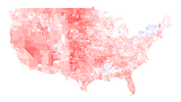
Nixon was re-elected in a landslide. Not only was McGovern staunchly anti-war during the Vietnam War, he was criticized for his first choice of running mate (who he fired). The only obvious counties on this map that voted more for McGovern than for Humphrey were in McGovern’s home state of South Dakota:

1972 (McGovern vs. Nixon) minus 1968 (Humphrey vs. Nixon)
1976
The Carter/Ford minus McGovern/Nixon map looks almost exactly the opposite, as the Watergate scandal destroyed Nixon’s and Ford’s standing. The South also rallied to Jimmy Carter, the first post-Civil War Southerner to be elected President.

1976 (Carter-Ford) minus 1972 (McGovern-Nixon)
1980
Jimmy Carter had his own troubles: the economy was in dire shape, in large part because of the rise in gas prices because of the second oil crisis. Carter also was not a strong leader: my memory of the time is that he suffered from what I called “Democrat’s dilemma”: being able to see all sides to all issues and thus unable to take a strong stand. Ronald Reagan, who exuded a forceful, “can-do” attitude, was more successful than the disgraced Ford almost everywhere:

1980 (Carter vs. Reagan) minus 1976 (Carter vs. Ford)
1984
Reagan got even more popular in large swaths of the country. Mondale could only manage to erode some of Reagan’s support in spots.

1984 (Mondale vs. Reagan) minus 1980 (Carter vs. Reagan)
Note that many of the blue counties above are areas of high Native American population. The map below shows counties where more than 30% of the people identify as Native Americans:

Counties with more than 30% Native American
I suspect that Reagan did something to upset Native Americans, but I don’t know what that was.
1988
George H.W. Bush was able to get elected in 1988, but he was pretty uniformly less successful than Reagan.

1988 (Dukakis vs. Bush41) minus 1984 (Mondale vs. Reagan)
1992
Bush continued to do worse in 1992, again pretty much across the whole country, losing to Clinton. Note that you can see the outline of Arkansas (home of Bill Clinton) clearly and Tennessee (home of Clinton’s VP Al Gore) somewhat.

1992 (Clinton vs. Bush41) minus 1988 (Dukakis vs. Bush41)
Ross Perot made a strong third-party run in 1992. I’m not sure who he took more votes from.

1992 third-party votes (mosty Perot)
1996
The Republicans made some inroads in 1996 in the West — especially in Bob Dole’s native Kansas (outline visible in the center of the country) — but it wasn’t enough. Clinton gained support in the upper Midwest, Northeast, Florida, Louisiana, and Southern Texas (which is heavily Latino).

1996 (Clinton vs. Dole) minus 1992 (Clinton vs. Bush41)
2000
Bush43 and Gore had a famously close race, but Bush43 did better than Dole almost everywhere (or Gore did worse than Clinton, depending on how you look at it).

2000 (Gore vs. Bush43) minus 1996 (Clinton vs. Dole)
2004
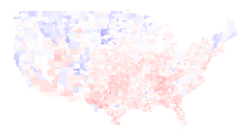
Bush43 strengthened his lead in the middle and southeast of the country in 2004, but lost support in some Northern and Western places:

2004 (Kerry vs. Bush43) minus 2000 (Gore vs. Bush43)
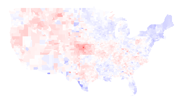
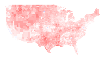
I’ve written about the 2008 vs. 2004 map already, so I won’t talk about it here. Instead, I think it is interesting to compare the 2008 election to the 1960 election, to see how the country’s party affiliations have changed:

2008 (Obama vs. McCain) minus 1960 (Kennedy vs. Nixon)
The biggest difference is that the Southeast is much, much more Republican now (except for minority-heavy areas: the Black belt and parts of Florida).
The New England states and the upper Midwest are much more Democratic. Native Americans voted heavily for Obama. Most importantly, perhaps, is that the Pacific coastal areas are much, much more Democratic than they were in 1960. (Those areas have also experienced a great deal of population growth, so this change is bigger than it looks.) The only area that seems like it stayed sort of the same is a belt running through Mossouri, Illinois, Indiana, and Kansas.
Note: The difference maps aren’t up on my maps page yet, but they hopefully will be soon.
Permalink
04.01.09
Posted in Technology trends at 3:13 pm by ducky
A while back, I hypothesized that women don’t go into computer science because it is a high-risk field. Today I want to share some anecdotal evidence from my own experience about how risky high-tech is. Since I turned 18, I have worked at many places, both as a contractor, summer intern, and regular full-time employee. Of the seven companies where I have a regular job, five ran out of money, one got bought, and one no longer makes the product I worked on. None of the companies I worked for were profitable when I left.
Regular jobs:
Contracts:
- NexGen (2 years). Bought by AMD. (This counts as an eventual success, but it took them eight years, three product cycles, and I-don’t-know-how-many-rounds-of-funding before they released their first product.)
- Cray Research (3 weeks). Bought by SGI, then sold to Tara Computer, which took over the Cray name.
- Data General (2 weeks). Bought by EMC.
- SGI (6 months). Filed for bankruptcy today.
- Apple (6 months). While the company still exists, they no longer make printers, which is the product I worked on.
- Sun Microsystems (6 months). In talks with IBM for IBM to buy Sun. Update: IBM didn’t buy Sun, but Oracle did.
- Triquest (1 month). Gone.
- Chicago Tribune (1 week). Still in business, but I wouldn’t bet on it being in business next year.
Summer jobs:
- EIT. Bought by VeriFone, which was then bought by HP. (This counts as a success!)
- Google. Still in business!
I realize that I’m probably on one long tail of the distribution, while my husband is on the other end. (Jim worked for Adobe for 16 years, and Adobe is still in business!) However, it shows that working in high-tech does have risks.
Permalink
03.30.09
Posted in Random thoughts, Too Much Information at 1:18 pm by ducky
I’ve had a constant question running in the back of my head for a long time, “Who would you have dinner with if you could?” (I talked about this a little in the post about Steve Wozniak.)
I have expanded it a little to which three people I would like to be at the same table with, or even just to witness. I’ve decided that my dream dinner team is Randall Munroe of xkcd, Nate Silver of fivethirtyeight.com, and Jon Stewart of The Daily Show.
How to go about pulling that off is a trickier matter. Step one would probably be to do something really interesting, such that I would be a desirable dinner date…
Permalink
03.14.09
Posted in Canadian life, Gay rights, Politics at 9:40 am by ducky
Recently, the California Supreme Court heard arguments in a case designed to overturn California’s Proposition 8, which overturned the judicial decision that gay and lesbian people had the right to marry. While I didn’t watch the hearings myself, I understand that Ken Starr (the defending attorney) basically put forth the belief that a majority vote could strip rights of minority.
People who are better than I at guessing what the outcome will be by examining the questions, tone, and body language of the justices think that they will rule against overturning Proposition 8, in part because they think that the California Domestic Partnership gives all of the same rights as marriage. Essentially, they are fighting over a word, with Starr’s side saying that a bare majority of the citizens can take away gay and lesbian people’s right to use the word “marriage”.
There was a Canadian political figure, Stockwell Day, who seemed to have similar beliefs in the rights of the majority over the rights of a minority. He pushed for a law that would have required a referendum on any proposal supported by a petition signed by 3% of Canadian voters. He stopped talking about this when Rick Mercer (sort of Canada’s Jon Stewart) called for a national petition forcing Stockwell Day to change his first name to “Doris”.
Perhaps the correct response to Proposition 8 is to put a constitutional amendment on the ballot requiring Ken Starr to change his first name to “Brenda”.
Permalink
03.05.09
Posted in Canadian life, Random thoughts at 2:08 am by ducky
If you know us, you know we have raved about the view from our apartment. It’s not the absolute best view in the world, but it is pretty stunning to a gal from the flat lands and buildings of Champaign, IL.

That picture (and an absolutely ginormous version) were taken and stitched together by Randy Stewart from Seattle.
Randy apparently walked into our apartment, said, “Oh my god!” or something such, and dashed into our bedroom to take pictures. Our other dinner guest, from metropolitan Canada, was slightly perplexed/bemused by his reaction. It is completely ordinary for people in cities in Canada to live in high-rise apartments.
Randy (and Jim and I) are from the US. It is very uncommon for people to live in high-rises in the US. If I think really hard, of all the thousands and thousands of people I have known, I can only think of six households who I know ever lived above the sixth floor, and one more who I think might have had a high-rise condo a few years ago. (And three of those households were in the same building in Mountain View.) That is it, period, total, everybody, and I had to think pretty hard to come up with that meagre ration.
Why are there so few high-rise residences in the US? There are many factors. I am by no means an expert, but these are a few:
- The American Dream of owning your own house is cliche for a reason. It is assumed that if you don’t own your own house, at least you aspire to owning your own house. To not aspire to have your own house is sort of like not wanting to own a TV.
- When renting, you generally get more square feet per dollar in a shared house than in an apartment, especially a shared apartment. Even I, through all my moves, have only lived in four apartments in the US, and two of those were while I was a student.
- In some places, the only high-rises around were “the projects” — government-built and -run publicly-subsidized housing. Thus high-rises were decidedly un-sexy.
- In California, where one-eighth of the US lives, cities can’t afford dense housing.
- California has earthquakes, which makes people nervous about high-rises, even though high-rises constructed to modern codes are much safer in earthquakes than older houses on landfill or alluvial floodplains.
- Traditionally, cheap gas has meant that it was feasible to live quite a ways from work.
- In the US, not having a car can have a significant negative impact on the quality of your life, parking is difficult in cities, and very few US cities have good public transportation systems. The poor transportation is due partly to density, but also part to the easy availability of guns. Many people in the US are afraid of taking public transportation.
You should also note that Vancouver has worked very hard to develop its downtown. The fact that it has a vibrant and vertical downtown was the result of very deliberate and careful urban planning, not an accident of fate.
UPDATE: I realized that several of the dorms at my US university were high-rises. I’m not sure that counts.
Permalink
02.20.09
Posted in Uncategorized at 12:35 pm by ducky
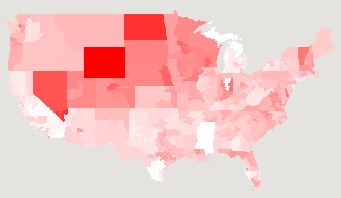
I have updated my stimulus map to give projected effects of the American Recovery and Reinvestment Act 2009 (AKA “the stimulus bill”), now that the bill is final. Here’s a snapshot of the per-capita jobs map:

There isn’t anything too surprising in this map. Note that the differences are actually rather small in reality: full white corresponds to 10.5 jobs created/saved per 1000 people, while full red corresponds to 15 jobs. One might also note that ~12 jobs per thousand sure doesn’t sound like a lot.
I only have data job creation forecasts, not tax cuts, education benefits, or extended unemployment benefits, as were in the map that showed proposed legislation.
I would like to also show the number of jobs that have been lost in the district over the past year, or the “GNP” (what’s the term for states or congressional districts?), but I don’t have that information.
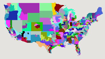
In order to make this map, I needed to load up the geometries for the US congressional House districts, and I found that interesting. I had expected to see really strangely-shaped districts, but by and large they looked pretty reasonable. It might be that the districts with most extreme gerrymandering are in urban areas, and hence too small to see easily. Rural areas have much more uniform demographics, so there is less incentive to draw bizarre shapes.
Here’s a map where each of the congressional districts is a random colour:

And, because it was easy, here’s a map of the party affiliations of members of the U.S. House of Representatives:
Update: the data that I’d gotten with the US congressional representatives was incorrect, so the picture I had at first in this post was wrong. I’ve updated the data file and the picture.
Permalink
02.17.09
Posted in Email, Too Much Information at 4:59 pm by ducky
This happened back in late 1994 or early 1995, but thinking about it still makes me laugh…
Ben Johnson, a graduate student at the University of Illinois developed a wonderful, wonderful webmail tool called @ATS to help NCSA provide email support for Mosaic, the first graphical Web browser. I was good friends with Mitch, who was in charge of Macintosh tech support for Mosaic, so I heard about it. I could see that it would be immensely helpful answering all the email questions I got in the course of my job as www.uiuc.edu webmaster, so talked NCSA/Ben into letting me use it also. Ben warned me that it was still quite new and under development, but I didn’t care — it made my life much easier even in that early stage.
Back in those days, there wasn’t nearly as much spam. The very first commercial Usenet spam had only come out in January 1994. Thus I was a little surprised to get a message to the webmaster account with an extremely pornographic subject line, and a body that was a word salad of dirty words.
I forwarded the message to Mitch, and asked in the body of the message, “Do you get messages like this frequently?” I got back a message from Mitch saying that yes, he did sometimes get messages like to the Mosaic support email address. Fine. I forgot about it.
The next day, I saw Ben. He said that he had needed to do some troubleshooting of @ATS, and had to go into my account to check something out. I had developed a webmail system myself, so empathized. This seemed perfectly understandable and reasonable to me. He continued by assuring me that he was only there for a moment and emphasized vigorously that he did not look in any of the messages, only at the subject lines.
I think he was puzzled but relieved when I burst out laughing.
I did explain why Mitch sent me a message with the subject
Subject: Re: verb your feminine-noun
and let Ben know that he didn’t need to inform the higher-ups about potential sexual harassment. 🙂
Permalink
02.16.09
Posted in Uncategorized at 11:10 am by ducky
Wow, Nate Silver just nailed it today. His posting on the two different meanings of the word “progressive” seemed very clear and resonated completely with me. I am, based on his definitions, absolutely a rational progressive.
Permalink
« Previous Page — « Previous entries « Previous Page · Next Page » Next entries » — Next Page »

