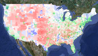
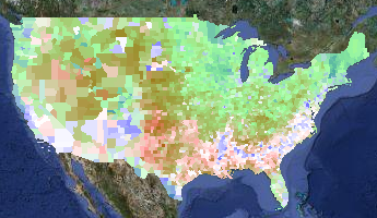
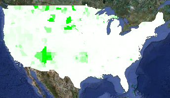
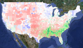
11.21.09
Posted in Maps at 1:27 am by ducky
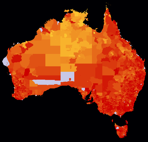
My friend Maciek Chudek and I entered two maps into the Mashup Australia contest: Shades of a Sunburnt People and Stimulating a Sunburnt People. The former shows information about the 2006 Australian Census:

Median age
Redder areas have a higher median age; gold areas are younger. (The red maxes out at 45 years old; any area with a median age of 25 or under is full gold.) Grey areas are ones which had so few people that the Australian Bureau of Statistics withheld the data for privacy reasons.
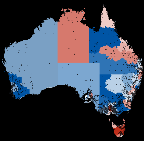
Our other map shows information about the rail, roads, and community infrastructure component of the Australian economic stimulus package:

Australian stimulus program spending
Blue areas are represented by the Australian Labor Party (which controls Parliament), and reddish areas are controlled by other parties. The darker the colour, the more money has been allocated. Dots represent individual projects. Like the Canadian economic stimulus package, we found a systematic bias favouring areas represented by the governing party.
Since these are so similar to my US census map and the Canadian stimulus map, you might think that this was totally straightforward to do. You might be wrong. We did quite a bit of massaging the data to get it out, and Maciek did a lot of analysis of the stimulus information.
Permalink
10.09.09
Posted in Maps at 11:34 am by ducky
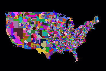
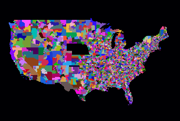
I have two more political layers up on my political/demographic map: US state senators and US state representatives (or assemblymembers, as they are called in some states). Alaska and Hawaii didn’t fit nicely on these images, but you can see them on the political/demographic map.
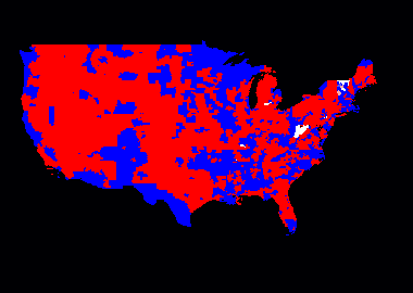
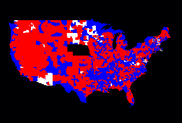
In the pictures below (and on my site), red is Republican; blue is Democratic. (To those outside the US who are used to red meaning liberal, the US does its colours backwards, sorry.) Some districts elect multiple members; in those cases I average the colour, with exact Democratic/GOP balance being white. In cases where there is a vacancy or a third-party affiliation, the colour is also white.
Here are the state senators:

Continental US State Senator Party Affiliation
Below is the party affiliation of the lower chamber members (which are usually called Representatives, but also sometimes Assemblymembers or Delegates). Note that Nebraska doesn’t have a lower chamber.

Continental US State Lower Chamber Members' Party Affiliation
Most of the party affiliation data came from the excellent Project Vote Smart. What they didn’t have, I gleaned from the appropriate state legislature’s page, Wikipedia, or both.
For comparison, the images below show all the districts in the continental US in random colours:

Continental US State Senate Districts

Continental US State Lower Chamber Districts
There are almost 8000 state and federal legislators in the US for a population of 300M people, or about one legislator per 375,000 people. The number of legislators varies wildly by state, however. New Hampshire currently has 424 state and federal legislators representing a population of 1.3M, or one legislator for every 3066 people. California currently has 176 representing a population of 36M, or one legislator for every 204,000 people.
Permalink
10.07.09
Posted in Maps at 7:11 pm by ducky
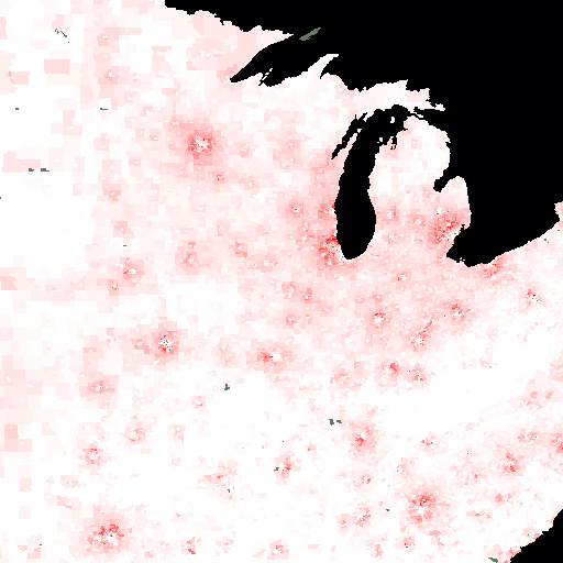
I just added the median household income to a demographics map, and my oh my you see so much more at the census tract level than you do at the county level. (I recommend making it a bit more opaque to help you see better.)
The map makes me think of mosquito bites: cities have a white center (low-income), surrounded by an angry red ring (the wealthy suburbs), with white again out in the rural areas:

In this image, full white is a median household income of $30,000 per year (in 1999 dollars), while full red is $150,000. Grey is for areas that the Census Bureau didn’t report a median income for — presumably because too few people lived there. The data is from the 2000 census.
Permalink
08.15.09
Posted in Hacking, Maps at 9:54 pm by ducky
It might not look like I have done much with my maps in a while, but I have been doing quite a lot behind the scenes.
Census Tracts
I am thrilled to say that I now have demographic data at the census tract level now on my electoral map! Unlike my old demographic maps (e.g. my old racial demographics map), the code is fast enough that I don’t have to cache the overlay images. This means that I can allow people to zoom all the way out if they choose, while before I only let people zoom back to zoom level 5 (so you could only see about 1/4 of the continental US at once).
These speed improvements were not easy, and it’s still not super-fast, but it is acceptable. It takes between 5-30 seconds to show a thematic map for 65,323 census tracts. (If you think that is slow, go to Geocommons, the only other site I’ve found to serve similarly complex maps on-the-fly. They take about 40 seconds to show a thematic map for the 3,143 counties.)
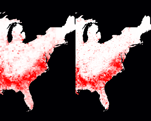
A number of people have suggested that I could make things faster by aggregating the data — show things per-state when way zoomed out, then switch to per-county when closer in, then per-census tract when zoomed in even more. I think that sacrifices too much. Take, for example, these two slices of a demographic map of the percent of the population that is black. The %black by county is on the left, the %black by census tract is on the right. The redder an area is, the higher the percentage of black people is.

Percent of population that is black; by counties on left, by census tracts on the right
You’ll notice that the map on the right makes it much clearer just how segregated black communities are outside of the “black belt” in the South. It’s not just that black folks are a significant percentage of the population in a few Northern counties, they are only significantly present in tiny little parts of Northern counties. That’s visible even at zoom level 4 (which is the zoom level that my electoral map opens on). Aggregating the data to the state level would be even more misleading.
Flexibility
Something else that you wouldn’t notice is that my site is now more buzzword-compliant! When I started, I hard-coded the information layers that I wanted: what the name of the attribute was in the database (e.g. whitePop), what the English-language description was (e.g. “% White”), what colour mapping to use, and what min/max numeric values to use. I now have all that information in an XML file on the server, and my client code calls to the server to get the information for the various layers with AJAX techniques. It is thus really easy for me to insert a new layer into a map or even to create a new map with different layers on it. (For example, I have dithered about making a map that shows only the unemployment rate by county, for each of the past twelve months.)
Some time ago, I also added the ability for me to specify how to calcualte a new number with two different attributes. Before, if I wanted to plot something like %white, I had to add a column to the database of (white population / total population) and map that. Instead, I added the ability to do divisions on-the-fly. Subtracting two attributes was also obviously useful for things like the difference in unemployment from year to year. While I don’t ever add two attributes together yet, I can see that I might want to, like to show the percentage of people who are either Evangelical or Morman. (If you come up with an idea for how multiplying two attributes might be useful, please let me know.)
Loading Data
Something else that isn’t obvious is that I have developed some tools to make it much easier for me to load attribute data. I now use a data definition file to spell out the mapping between fields in an input data file and where the data should go in the database. This makes it much faster for me to add data.
The process still isn’t completely turnkey, alas, because there are a million-six different oddnesses in the data. Here are some of the issues that I’ve faced with data that makes it non-straightforward:
- Sometimes the data is ambiguous. For example, there are a number of states that have two jurisdictions with the same name. For example, the census records separately a region that has Bedford City, VA and Bedford County, VA. Both are frequently just named “Bedford” in databases, so I have to go through by hand and figure out which Bedford it is and assign the right code to it. (And sometimes when the code is assigned, it is wrong.)
- Electoral results are reported by county everywhere except Alaska, where they are reported by state House district. That meant that I had to copy the county shapes to a US federal electoral districts database, then delete all the Alaskan polygons, load up the state House district polygons, and copy those to the US federal electoral districts database.
- I spent some time trying to reverse-engineer the (undocumented) Census Bureau site so that I could automate downloading Census Bureau data. No luck so far. (If you can help, please let me know!) This means that I have to go through an annoyingly manual process to download census tract attributes.
- Federal congressional districts have names like “CA-32” and “IL-7”, and the databases reflect that. I thought I’d just use the state jurisdiction ID (the FIPS code, for mapping geeks) for two digits and two digits for the district ID, so CA-32 would turn into 0632 and IL-7 would turn into 1707. Unfortunately, if a state has a small enough population, they only get one congressional rep; the data file had entries like “AK-At large” which not only messed up my parsing, but raised the question of whether at-large congresspeople should be district 0 or district 1. I scratched my head and decided assign 0 to at-large districts. (So AK-At large became 0200.) Well, I found out later that data files seem to assign at-large districts the number 1, so I had to redo it.
None of these data issues are hard problems, they are just annoying and mean that I have to do some hand-tweaking of the process for almost every new jurisdiction type or attribute. It also takes time just to load the data up to my database server.
I am really excited to get the on-the-fly census tract maps working. I’ve been wanting it for about three years, and working on it off and on (mostly off) for about six months. It really closes a chapter for me.
Now there is one more quickie mapping application that I want to do, and then I plan to dive into adding Canadian information. If you know of good Canadian data that I can use freely, please let me know. (And yes, I already know about GeoGratis.)
Permalink
05.10.09
Posted in Maps, Politics at 6:38 pm by ducky
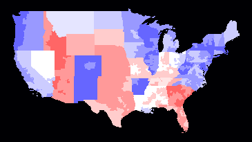
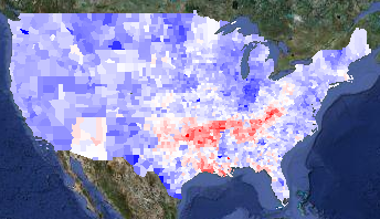
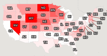
I added a state legislatures partisanship layer to my election map, and also modified a metric which shows kind of how liberal an area is. For every governor, US senator, or US congressman in a district that is a Democrat, I added one. For every legislator who is a Republican, I subtracted one. Now, with the new data, I also add one point for each state legislative chamber that is controlled by Democrats, and subtract one for each that is controlled by Republicans.
This gives me a range of -6 to plus 6 (governor, two US senators, one US congressman, one state senate, one state lower chamber), which I can show in shades of red to blue:

Some things are not surprising: the northeast is very blue; Idaho and Utah are very red. However, I don’t get Arkansas. I wouldn’t have thought that it would be culturally very different from its neighbours, yet most of the state has the maximum value of +6.
Is this all due to Clinton? Did he build a really strong Democratic Party operation in Arkansas? Or did he throw a bunch of money towards Arkansas, for which they are still grateful?
Can anyone familiar with Arkansas shed any light on this?
UPDATE:
A reader from Arkansas explained that the Arkansas Democratic party is very entrenched and strong, but that the populace is not particularly liberal. Essentially, people who are Democrats in Arkansas would be Republicans just about anywhere else. (This is similar to the Liberal Party in BC, which is the most conservative of the three viable parties in BC. The Liberal Party in BC is much more conservative than the Canadian federal Liberal party.)
Permalink
04.19.09
Posted in Maps, Politics at 4:56 pm by ducky
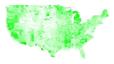
I have been looking at unemployment figures today. Here’s unemployment rate by county for 2008, from the Bureau of Labor Statistics. Pure white corresponds to a rate of 2%; pure green corresponds to a rate of 10%.

Unemployment Rate 2008
Note that the unemployment rate is dimensionless, i.e. it’s the number of people looking for work divided by the number of people in the workforce. The BLS makes its estimates by interviewing thousands of people each week and carefully asking them questions about their employment. If they have worked at all in the past week (even part-time), that counts as employed. If they haven’t looked for work in four weeks, they do not count as being in the workforce. This means that retired people, stay-at-home moms, and people who have given up do not count. (The BLS has a good explanation of their methods.)
Here is the unemployment rate by county for 2007:

Unemployment Rate 2007
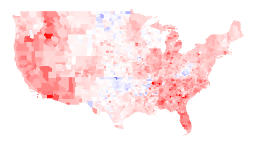
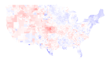
Again, I think the more interesting picture is the difference between the two years; red where unemployment has gone up, blue where unemployment has gone down. Full red means a change of +5 percentage points or more; full blue means a change of -5 percentage points or more.

2008 unemployment rate minus 2007 unemployment rate
There’s an awful lot of red there, alas. The unemployment rate fell in 272 counties and rose in 2767 counties.
Things worth noting about the above maps:
- There are a fair number of state boundaries visible in the 2008 minus 2007 map. For examples, Wisconsin is particularly visible, Wyoming is visible to a lesser extent, and there is also a line visible running along the north side of Oklahoma, Arkansas, Alabama, Mississippi, and South Carolina, and a line along the east side of Alabama. I think this means that state policies actually do matter.
- West Virginia had lower unemployment in 2008 than 2007. I presume that was demand for coal relating to the high price of oil in most of 2008. The Oklahoma drops in unemployment also be due to the higher value of oil; I don’t know why North Dakota did better.
- Woods County, OK, which is the bright blue spot in near the center of the country in the 2008 minus 2007 map, has a relatively small population: 120 people were unemployed in 2008 versus 261 in 2007. Oklahoma’s economy has a large fossil fuel component.
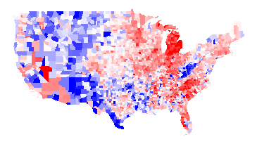
It’s also interesting to look at the difference between 2008 and 1998:

2008 unemployment rate minus 1998 unemployment rate
Thoughts:
- Poor Michigan.
- In addition to West Virginia, the rural West had higher unemployment in 1998 than in 2008. I presume this has to do with the very strong market for resources (trees, minerals, coal, etc.) for most of 2008.
I have added the first three maps to my elections map page. (Note that I have data such that I can put even more maps on the page, but I worry about the UI getting too cluttered. Thus, if you really want to see some map, let me know.)
Update: A friend of a friend pointed me at Wisconsin Business Climate Statistics. That page points out the Wisconsin has a very lean government, low taxes, low crime,and tax exemption for energy used in manufacturing. Frankly, it sounds like a Republican party platform — even though Wisconsin is a very Democratic-leaning state.
Permalink
04.13.09
Posted in Maps, Politics at 5:51 pm by ducky
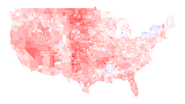
I recently got historical data on presidential election results by county from Robert Vanderbei, for presidential elections 1960-2004. While it is interesting to look at the raw data, I find it even more interesting to look at the differences between years, like the 2008 vs. 2004 map I commented on already. This helps separate how people felt about a particular pair of politicians from how liberal/conservative they are in general. For example, here’s the 1960 (Nixon vs. Kennedy) map, with Democratic counties in blue and Republican counties in red:

1960 -- Kennedy vs. Nixon
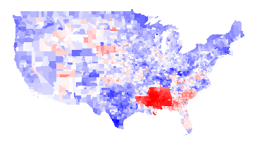
And here’s the 1964 (Johnson vs. Goldwater) map:

1964 -- Johnson vs. Goldwater
1964 Difference
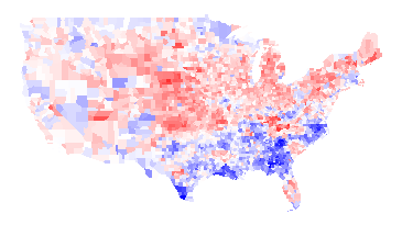
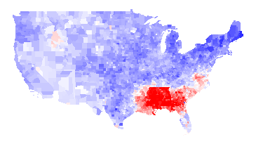
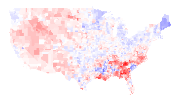
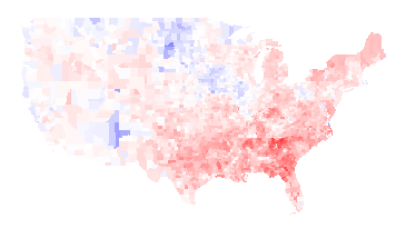
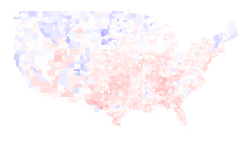
You can see even from the 1964 map that LBJ was not very popular in the South (presumably because of his civil rights work), but the difference map below really hammers it home. In this map, it is blue if LBJ did better than Kennedy and red if the reverse. You can see from the difference map that the South really hated LBJ:

1964 results minus 1960 results
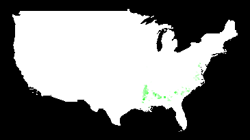
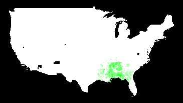
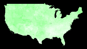
Another interesting thing about the 1960/1964 maps is that there is no evidence at all of “the black belt”. Here is a map of counties which were majority black in 2000, with darker green the stronger their majority:

Majority-black counties (2000)
I have to believe that blacks would have overwhelmingly voted for LBJ — if they were able. I think this is a pretty vivid demonstration of how thoroughly their voting rights were repressed.
1968 vs. 1960
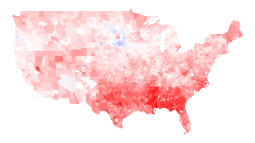
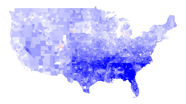
The 1968 (McGovern-Nixon) minus 1964 map is basically an inverse of the 1964 minus 1960 map, basically because the southern antipathy towards Johnson was so strong that it skews everything. A more interesting map is to compare Humphrey vs. Nixon to Kennedy vs. Nixon:

1968 (Humphrey-Nixon) minus 1960 (Kennedy-Nixon)
Humphrey explicitly called for the Democrats to move away from states’ rights and towards civil rights, and that apparently played well in the upper Midwest and Northeast but not as well in the Southeast or West. You can also see a faint outline of Minnesota (where Humphrey was from) and a strong outline of Maine (where Muskie, the Democratic VP, was from). (Maryland, where Nixon’s VP Spiro Agnew was from, is too small to see in this picture.) You can maaaybe start to see the majority-black counties in some states, but not in Georgia.
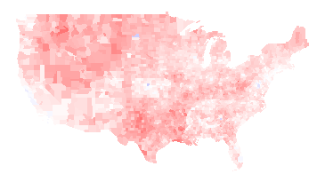
There are some blue areas in the above map, but those probably would be red if it weren’t for George Wallace. Wallace ran as an independent, and did extremely well in southern states. It is unlikely that he took any votes away from Humphrey, as he was an outspoken proponent of segregation. While third-party candidates usually struggle to get over 10% of the vote, Wallace won a number of states outright. Here is a map of counties that he won outright:

Counties won by Wallace in 1968
1972
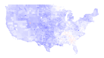
Nixon was re-elected in a landslide. Not only was McGovern staunchly anti-war during the Vietnam War, he was criticized for his first choice of running mate (who he fired). The only obvious counties on this map that voted more for McGovern than for Humphrey were in McGovern’s home state of South Dakota:

1972 (McGovern vs. Nixon) minus 1968 (Humphrey vs. Nixon)
1976
The Carter/Ford minus McGovern/Nixon map looks almost exactly the opposite, as the Watergate scandal destroyed Nixon’s and Ford’s standing. The South also rallied to Jimmy Carter, the first post-Civil War Southerner to be elected President.

1976 (Carter-Ford) minus 1972 (McGovern-Nixon)
1980
Jimmy Carter had his own troubles: the economy was in dire shape, in large part because of the rise in gas prices because of the second oil crisis. Carter also was not a strong leader: my memory of the time is that he suffered from what I called “Democrat’s dilemma”: being able to see all sides to all issues and thus unable to take a strong stand. Ronald Reagan, who exuded a forceful, “can-do” attitude, was more successful than the disgraced Ford almost everywhere:

1980 (Carter vs. Reagan) minus 1976 (Carter vs. Ford)
1984
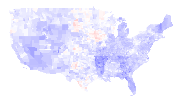
Reagan got even more popular in large swaths of the country. Mondale could only manage to erode some of Reagan’s support in spots.

1984 (Mondale vs. Reagan) minus 1980 (Carter vs. Reagan)
Note that many of the blue counties above are areas of high Native American population. The map below shows counties where more than 30% of the people identify as Native Americans:

Counties with more than 30% Native American
I suspect that Reagan did something to upset Native Americans, but I don’t know what that was.
1988
George H.W. Bush was able to get elected in 1988, but he was pretty uniformly less successful than Reagan.

1988 (Dukakis vs. Bush41) minus 1984 (Mondale vs. Reagan)
1992
Bush continued to do worse in 1992, again pretty much across the whole country, losing to Clinton. Note that you can see the outline of Arkansas (home of Bill Clinton) clearly and Tennessee (home of Clinton’s VP Al Gore) somewhat.

1992 (Clinton vs. Bush41) minus 1988 (Dukakis vs. Bush41)
Ross Perot made a strong third-party run in 1992. I’m not sure who he took more votes from.

1992 third-party votes (mosty Perot)
1996
The Republicans made some inroads in 1996 in the West — especially in Bob Dole’s native Kansas (outline visible in the center of the country) — but it wasn’t enough. Clinton gained support in the upper Midwest, Northeast, Florida, Louisiana, and Southern Texas (which is heavily Latino).

1996 (Clinton vs. Dole) minus 1992 (Clinton vs. Bush41)
2000
Bush43 and Gore had a famously close race, but Bush43 did better than Dole almost everywhere (or Gore did worse than Clinton, depending on how you look at it).

2000 (Gore vs. Bush43) minus 1996 (Clinton vs. Dole)
2004
Bush43 strengthened his lead in the middle and southeast of the country in 2004, but lost support in some Northern and Western places:

2004 (Kerry vs. Bush43) minus 2000 (Gore vs. Bush43)
I’ve written about the 2008 vs. 2004 map already, so I won’t talk about it here. Instead, I think it is interesting to compare the 2008 election to the 1960 election, to see how the country’s party affiliations have changed:

2008 (Obama vs. McCain) minus 1960 (Kennedy vs. Nixon)
The biggest difference is that the Southeast is much, much more Republican now (except for minority-heavy areas: the Black belt and parts of Florida).
The New England states and the upper Midwest are much more Democratic. Native Americans voted heavily for Obama. Most importantly, perhaps, is that the Pacific coastal areas are much, much more Democratic than they were in 1960. (Those areas have also experienced a great deal of population growth, so this change is bigger than it looks.) The only area that seems like it stayed sort of the same is a belt running through Mossouri, Illinois, Indiana, and Kansas.
Note: The difference maps aren’t up on my maps page yet, but they hopefully will be soon.
Permalink
02.09.09
Posted in Maps, Politics at 4:11 pm by ducky
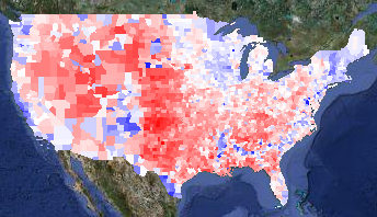
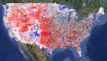
I have added the 2004 presidential election results to my politics/demographics map. Loading that data also let me provide a map of the difference between the 2004 and 2008 election:

2008 v. 2004 presidential election results
The map is red in counties that voted more Republican in 2008 and blue for counties that voted more Democratic. I think it is interesting that Arizona — McCain’s home state — pops out very clearly, while Illinois does not.
Anthony Robinson did a heroic job pulling out all the 2004 data, but there were a lot of problems with the data. I presume he had to work with preliminary data, while I could get final data. I scraped information from AZ, CA, GA, IN, LA, MO, NC, NY, TX, and VA, so I have high confidence in those states. I want to look a little more closely at Illinois — I need to be in Windows to get at that data, ugh. Alaska is a pain because it is done by house district and not by county, so I will get that in a little later.
A friend of mine had seen a similar map in the New York Times, and was surprised that Louisiana was so red. He thought that it was odd that, given the snafus after Katrina, it would have been strongly anti-Republican. I thought perhaps the data was just incorrect, but no — I verified the Louisiana data. My best guess is that the white people outside New Orleans saw a lot of images about people behaving badly in New Orleans in the Katrina aftermath. Those people were predominantly black, and I can believe that the white people nearby associated bad behaviour with “black people” instead of with “desperate poor people” or “strung-out drug addicts without a fix” or even “criminals”. They might be more inclined to vote against Obama for being black.
I actually find Oklahoma odder: Oklahoma has a relatively high percentage of Native Americans. In many places, they voted very strongly for Obama. Not in Oklahoma, they didn’t.
I also added information on governors’ and senators’ party affiliations because it was really easy to do so.
Update1: Looking at the red zones, I notice that there are very hard edges on the redness at the northern boundaries of Arkansas and Tennesee. Perhaps it isn’t really that Obama did particularly poorly there, but that Kerry did particularly well, perhaps by association with Arkansan Bill Clinton and Tenneseean Al Gore? It would be interesting to compare Obama’s margins with Jimmy Carter’s, but I don’t think it will be easy to get the 1976 election results by county.
Update2: I did find better data — all the way back to 1960! I blogged about it.
Update3: I found someone in Oklahoma. He said that Oklahoma has a low educational level, and that while many people claimed Native heritage, many of the people were only a minority Native, and were culturally white.
Permalink
02.08.09
Posted in Maps, Politics at 5:23 pm by ducky
I made a new map of where the stimulus spending was forecast to go. I pulled the data from the White House Web site a few days ago, so note that it is for the proposed stimulus bill, not the bill as it passed. Also, it shows per capita amounts, using 2006 population figures from Wikipedia, so there will be a minor error due to the years being different.
I didn’t make a lot of noise about this one because I hope to do another, better one when the numbers are more stable.

Jobs created or saved per capita
Permalink
02.01.09
Posted in Maps at 11:46 am by ducky
I made a demo of my new mapping framework, a choropleth map of the 2008 presidential election that you can combine with various demographic layers, zoom in, zoom out, change the colour mapping, and all kinds of good things.
The base layer is a map of the election results by county. Here it is with all the controls clipped off:

Voting margin layer
Blue counties are ones where more people voted for Obama; red counties voted for McCain. The intensity of the colour shows how big the spread between the two candidates was. Counties are white if the race was close.
A liberal friend of mine said with some dismay, “That’s an awful lot of red!” That’s true, but most of those red counties have very few people in them. One way to get a sense of how few people live in the center of the country is to overlay ZIP code locations (presumably the centers of the ZIP codes):

Voting layer with ZIP codes overlay
(The ZIP layer is even more interesting in bigger images. I’m showing cropped, tiny versions of the map; you can select medium and huge sizes too.)
Another way to see the population density is to overlay the population density layer on top of the voting layer. I set the population density layer to go from full white at zero people per square mile to full green at 400 people per square mile:

Voting layer plus population density overlay
Note that 400 people per square mile is still very, very low compared to urban areas. (New York City has around 50,000 people per square mile. Some census tracts in San Francisco have around 200,000 people per square mile; San Quentin has a density of 250,000 people per square mile.) I recommend playing with the colour mapping to get a sense of how dramatically unevenly the country is populated.
The next thing to look at is where the Obama voters were. In addition to urban areas, racially diverse areas went for Obama pretty stunningly consistently. If you lay the percent-White layer on top of the voting layer, it is really striking how often the blue of an Obama county coincides with the white of a low-percent-White county. In the percent-White overlay in this map, full white corresponds to 70% of the population or less being White, while full green corresponds to 100% White:

Voting layer plus percent-White overlay
You can see that the West Coast and the South are more racially diverse, as well as some odd, isolated islands of blue in the middle of the country — mostly in the Mountain time zone. What are those odd blocks?
Those isolated patches of high-Obama, low-White correlate with Native American population. Here is a map of the percent-Native, with full white corresponding to 70% Native population and full green corresponding to 100% Native population. (I turned off the voting layer in the next picture.)

Percent Native American Layer
Not every place with a high Native population went for Obama. For example, Oklahoma has a high Native population, but Oklahoma went for McCain pretty reliably.
The sharp-eyed viewer will note a few blue counties in Idaho, Montana, and Wyoming that do not have a high percentage of Native Americans. These are the urban areas of Butte and Missoula, plus the resort areas of Sun Valley and Jackson Hole.
A prominent feature on the electoral layer is the blue crescent in the South. That corresponds neatly with high concentrations of African-Americans. On the demographic layer on this map, full white corresponds to 0% African-American and full green corresponds to 50% African-American:

Voting layer plus percent Black layer
You can see correlation between Latino populations and Obama voters, although it isn’t as strong a correlation as elsewhere. In the demographic layer of the map below, full white is 0% Latino and full green is 50% Latino:

Voting layer plus percent Latino layer
Finally, there are some pale counties in the Midwest that are surrounded by red counties. I haven’t looked at each and every one, but I think they are college towns. Here’s a zoomed-in overlay of median age over the voting layer, with full white corresponding to a median age of 25 and full green to a median age of 45:

Voting layer plus median age layer
The areas that voted for Obama that can’t be explained by population density, racial diversity, or college towns are the upper midwest (e.g. Minnesota, Wisconsin, and Iowa) and the upper Northeast (e.g. Maine and Vermont). Obama spent a lot of time in Iowa, but I guess the others are just intrinsically liberal.
I also have point-based overlays for locations of Walmarts and health food stores. During the campaign, Fivethirtyeight.com talked frequently talked about the Walmart-to-Starbucks ratio, so I wanted to show those. Unfortunately, although I found a database of Starbucks locations, I wasn’t able to get permission to use it on my maps. (It’s a pity, because Starbucks locations seemed to correlate very well with Obama votes.) I bought data of Walmart locations and health food stores (figuring that health food stores would be a squishy liberal kind of thing) but eyeballing the data didn’t really convince me there was a correlation. But you can go try it out for yourself.
You can also see the locations of all 756 Native / Alaskan / Hawai’ian reservations from the dots layer.
Finally, I have a layer that shows the total votes (Obama + McCain + everyone else) divided by the population. I don’t know how much to trust this layer, as the demographic data I have is from the 2000 census. Areas that gained or lost a lot of people in the past eight years will be skewed. While the demographic data in all the demographic layers will be slightly off, it will be worse for this layer, especially in counties that don’t have a lot of people. (Loving County, TX, had 79 presidential votes in 2008 but only 67 total population in 2000.) Rural counties tend to have more land area than urban counties, so visually they will be overrepresented.
I encourage you to go play with the maps. In particular, I had to use zoom level 3 in order to get maps that would fit on my blog, but you lose a lot of detail and information. Also, when you aren’t worrying about running afoul of Google’s copyrights, you can let the map layer peek through to give you more context for what you are seeing.
Enjoy!
Permalink
« Previous Page — « Previous entries « Previous Page · Next Page » Next entries » — Next Page »
